Table of Contents
Resource - Shadow
Total Launcher Shadow Guide: Drop Shadows, Elevation, and Depth
Shadow Resources in Total Launcher serve as essential visual anchors that introduce depth, layer elevation, and three-dimensional realism to custom Android themes. Applying drop shadows to text, icons, vector shapes, or window containers lifts interactive elements above static backgrounds, improving legibility and interface hierarchy. Because Total Launcher uses hardware-accelerated rendering, a user must master specific configuration constraints, such as canvas margin expansion and alpha floor preservation, to prevent edge clipping and invisible render artifacts. The following technical guide outlines proper shadow creation, parameter options, and core architectural rules.
Quick Start: The Two Rules of Drop Shadows
Total Launcher relies on Android's native rendering engine, which features specific behaviors. Use these two concepts when working with graphic objects:
To create a reliable drop shadow, follow these guidelines:
- For a Solid Shadow: - Assign the shape or picture/image to the Object's Edit Option dialog
Image(foreground) property (the first element), and assign the shadow preset to its singleBackgroundproperty in that dialog. An example of that dialog is shown here. - For a Hollow Ring Shadow: - Applies a border width of at least
3to the shape, and sets the Alpha Fill opacity to 1% (e.g.,ARGB 01000000). - For ALL Shadows (The Margin Rule): - Increases the object's
Marginsin the direction the shadow falls. The margin value must be equal to or greater than the shadow's radius to prevent the soft edges of the shadow from hitting the object's invisible bounding box and clipping.
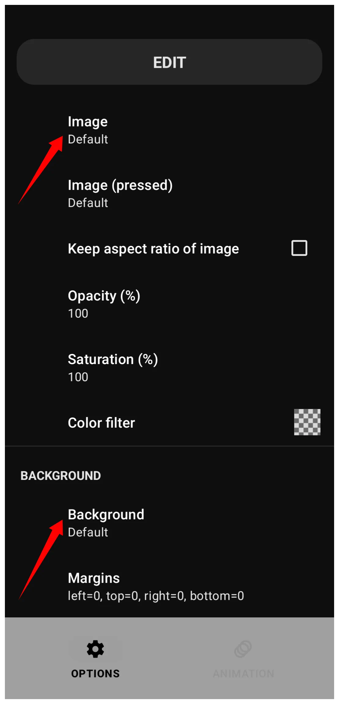
When a drop shadow is desired, avoid the following actions:
- 0% Alpha Transparency: - Never sets a shape's fill to exactly
00(e.g.,ARGB 00000000). The rendering engine assumes the object is completely invisible and instantly deletes the shape, border, and shadow from the screen to save processing power. - Margins at 0: - A zero margin forces the shape to touch the absolute edges of its container, leaving zero physical room on the canvas for the shadow to be drawn.
- Stacking Backgrounds: - The
Backgroundmenu is a single-occupancy slot. Accommodates a Shape resource or a Shadow resource, but cannot stack them directly inside the same menu field at the same time.
What is a Shadow Resource?
Total Launcher offers a “library” of user-created shadow presets for visual depth and separation from background objects. The library is viewed by navigating to the Main Menu > Launcher options > Resources > Shadow as shown in this dialog.

Common uses for shadow resources include:
- Drop shadows vs. inner shadow (native possible???)
- Custom bases
- Floating cards/shapes
- Lifted buttons/images- Serves as bases for custom buttons, cards, or icons.
- Layered UI effects
- Text Emphasis - Emphasizes text with graphic effects.
The Built-in Shadow Library
Total Launcher offers no core library of shadows, only the space to store user-created shadow effects.
Customizing and Editing Shadows
Once a user selects a shadow, they can adjust its properties to fit the desired theme. Creation and modification happen via the Main Menu > Launcher options > Resources > Shape > Add icon
| Shadow Add Dialog | Element Descriptions |
|---|---|
The Shadow Add dialog | • Label: - Enter a filename (no spaces/only underscore _ for separators) to ID when saved.• Shadow color: - See a full review of TL's Color Picker here. See the discussion below for successful shadow color selection on different backgrounds. • Shadow radius: - Controls the spread/softness of the shadow. “Radius” technically measures a distance (in pixels) the blur extends from the object's edge. (A technical review of “Radius” is here.) Visually, it determines how “fuzzy” the shadow appears. » Low values (1-5): Tight, hard-edged shadow mimicking a harsh light source. » High values (10+): Wide, soft-edged shadow mimicking a large, diffused light source. ⇒ Note: If Offset X/Y = 0, the shadow remains perfectly centered behind the object; a higher radius will make it “glow” out from all sides. • Shadow offset X: - Controls the horizontal position of the shadow relative to the object. Positive values push the shadow to the right; negative values push the shadow to the left. • Shadow offset Y: - Controls the vertical position of the shadow relative to the object. Positive values push the shadow down; negative values push it up. |
Practical Applications
<do samples and include how to procedure> The following are methods to apply shadows in object design:
- Layered Image or Shape Frames: - Acts as a strict clipping mask for a photograph with its own background frame to create a floating border effect.
- Uniform Legacy Icon or Card Reshaping: - Unifies application icons or user-created cards by reshaping them using a built-in background shape and margins, eliminating the need for external alpha mask files.
Recommended Offsets and Radius for a Modern UI Design
In modern UI design, light usually comes from directly above or slightly “front-and-top.” This means the X offset is often 0 (centered horizontally), and the Y offset is positive (pushing the shadow down). Below are suggested settings for the X/Y Offsets and radius if a user wants this style.
| Style | Offset X | Offset Y | Radius | Appearance |
|---|---|---|---|---|
| Subtle Lift | 0 | 2 | 4 | Clean, professional, slightly elevated |
| Floating Card | 0 | 8 | 12 | High elevation, like a physical card held over the screen |
| Retro / Pop | 4 | 4 | 2 | Distinct, “sticker-like” sharp edge |
| Soft Glow | 0 | 0 | 20 | High-end “aura” effect (only works if radius is high). |
Tips to Perfect Shadows and the Technical Reasoning Behind Each
- Do increase margins:
- Prevent clipping by increasing the object's margins to be greater than or equal to the shadow's radius and offset
- See the technical discussion here.
- Do not use 0% Alpha:
- Avoid an Alpha Fill opacity of exactly
00since this causes the rendering engine to skip the calculation and delete the shadow and border entirely to save processing power. - See the technical discussion here.
- Do use 1% Alpha for hollow shapes:
- Trick the engine into rendering a shadow for a transparent shape by setting the Alpha Fill opacity to
01combined with a thick border. - See the technical discussion here.
- Do not rely on gradient shadows: - Shadows ignore image or shape internal gradient fades and cast a uniform blur based solely on the mathematical outer boundary of the shape. The shadow is generated based on its options (color, radius, and offsets).
- See the technical discussion here.
- Do use high opacity on dark themes:
- Overcome the luminance floor and maintain visibility on dark wallpapers by utilizing high alpha values (80%+) or solid colors.
- See the technical discussion here.
- Do utilize color wheel opposites:
- Create visual separation on exceptionally dark backgrounds by applying a hue-shifted shadow from the opposite side of the color wheel.
- See the technical discussion here.
Technical Note: The Gaussian Safety Buffer
While Rule 1 states that Margin must be ≥ (Radius + Offset), high-radius shadows require a “Safety Buffer”.
- The Rule of Thumb: For any Radius over 20, multiply the required margin by 1.2.
- Example: If the Radius is 50 and Offset is 10, do not set the Margin to 60. Set it to 72 to account for the “tail” of the Gaussian blur.
Design Tip: To test the shadows effectively, always set the Launcher wallpaper to the color recommended in the “Best Use On” column of the configuration tables. Testing a “Light Mode” shadow on a “Dark Mode” background will always result in a “Contrast Wall” failure.
UI Navigation Note: The Single Slot Background
When configuring a Graphic Object's Options (gear) menu, the Background property is a single-occupancy slot.
- A shape, an image, a color or a shadow can be assigned to this slot, but cannot be combined to stack them directly inside the same Background menu level.
- To apply a shadow based on a specific custom shape's properties, the Shape Resource must reside in the object's top Image (foreground) slot, while the Shadow preset resides in the Background slot.
Performance Hits from Radius/Blur Use
< write this >
</WRAP>
Comments & Feedback
Toby Lancer is ready to help! Look for the Quick Help form:
► Desktop: left sidebar located near the bottom for Private to Admin
► Mobile: 3-bar menu at page top.
► Use the Discussion section below to share any experiences and communications with other Total Launcher users.
► Any Registered User can directly update this and any wiki page if desired.
Moderation: To keep the manual clean, all comments are held for appropriateness review. Preview any comment before submitting it. It will not be displayed after submission until it is reviewed. So, please, do not resubmit.
Formatting: If using any code snippets, place them inside code tags (e.g., 'code') using double single quotes (') before and after to keep them readable.
Be Kind: This is a community effort. Please keep feedback constructive and on topic.
~~DISCUSSION~~