Shape - Fill
Dialog selections are discussed below or next to the image. The image contains no navigation selections. To return to the previous page, swipe (right to left), use the browser's return arrow, or select the Backlink icon  from the right sidebar.
The pattern characteristics of these fills are gradients using the colors selected for Color 1 and Color 2
• Top row - consists of a solid Color 1 with gradient files of Color 2. Shown below is a sample of Color 1 set to white and Color 2 set to red:
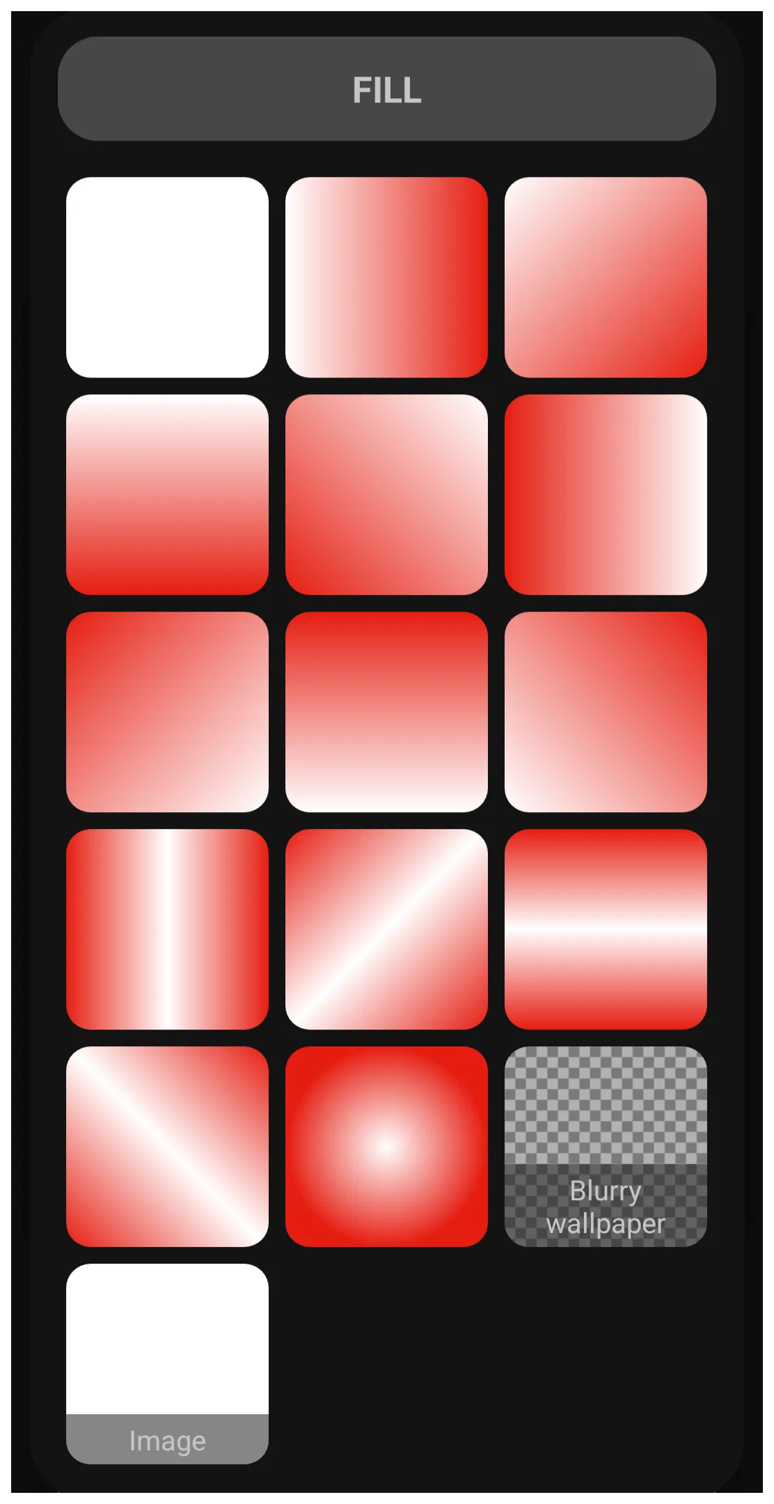 • Middle rows - offer more transparency from Color 2 giving soft light effects
• Blurry wallpaper - The full bottom row offers more complex effects, such as “Blurry wallpaper” creating a soft-focus aesthetic.
• Image - This last row is strictly an image from user resources
• Middle rows - offer more transparency from Color 2 giving soft light effects
• Blurry wallpaper - The full bottom row offers more complex effects, such as “Blurry wallpaper” creating a soft-focus aesthetic.
• Image - This last row is strictly an image from user resources
Once the user selects the fill pattern, the app would navigate to the previous screen/dialog. In this demo, swipe right-to-left or use the browser's back arrow.

</WRAP>
===== Hidden Index Anchors =====
Comments & Feedback
Toby Lancer is ready to help! Look for the Quick Help form:
► Desktop: left sidebar located near the bottom for Private to Admin
► Mobile: 3-bar menu at page top.
► Use the Discussion section below to share any experiences and communications with other Total Launcher users.
► Any Registered User can directly update this and any wiki page if desired.
Moderation: To keep the manual clean, all comments are held for appropriateness review. Preview any comment before submitting it. It will not be displayed after submission until it is reviewed. So, please, do not resubmit.
Formatting: If using any code snippets, place them inside code tags (e.g., 'code') using double single quotes (') before and after to keep them readable.
Be Kind: This is a community effort. Please keep feedback constructive and on topic.
~~DISCUSSION~~