meta data for this page
Object Shadows on Dark Backgrounds: Using Complementary Colors for Better UI Depth
Master UI visual hierarchy in dark themes with strategic object shadowing. Learn how leveraging complementary colors creates realistic depth, improves element separation, and enhances interactive user experiences.
Shadowing an object is more than just a “cool” effect — it is a fundamental visual anchor that provides the three-dimensional “lift” necessary for a professional interface. By creating a separation between the object and its background, the user's eye sees what is interactive and what is static.
However, the rules of physics often break down when attempting shadows in digital design. On a light background, luminance (a measure of light intensity) reaches its limit in allowing traditional dark shadows to provide perfect, realistic contrast. This happens when the base color is a dark hue, like a deep navy or OLED black, and a traditional shadow has nowhere to go, a darkness into the dark. This is called a “luminance floor”, which makes it impossible to use darkness to create depth. To help a viewer's eye perceive the intended separation, a setup must shift its strategy from value, or light versus dark, to chroma, or color contrast for a hue separation.
In this wiki's section on Shadows, the following rule for hue separation is offered to trick the brain into seeing “depth” through color temperature rather than brightness. By placing a “cool” shadow behind a “warm” object (or vice versa), a visual impression is made at that edge which the eye interprets as physical distance.
Hue-Shift Separation (The Chroma Rule)
☛ On deep, dark backgrounds (Value < 15%), standard shadows are swallowed by the darkness. Bypass luminance entirely by using Chroma Separation.
☛ Select a shadow's color from the opposite side of the color wheel to create a visual “spark” that defines the object's edge where “light” can no longer.
The following tutorial will show how to bypass the “Contrast Wall” using a simple web-based tool to find the perfect “Chroma Opposite” for a setup.
| Description | Instructive Sample Image |
|---|---|
| Sample of a Rule 6 Hue-Shift for a shadow on a dark background 👉 | 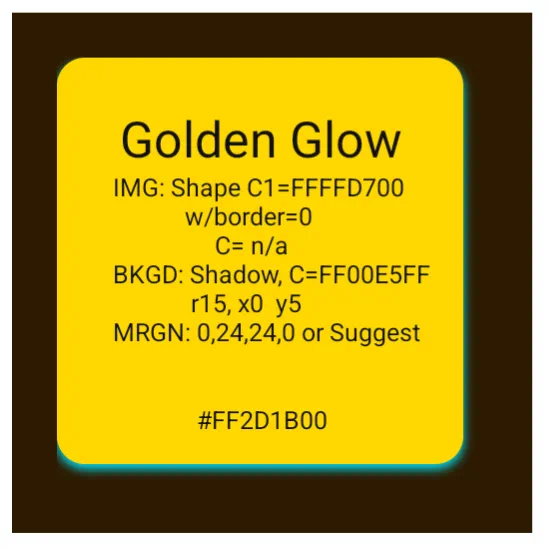 |
Identify the background's Hex
- Open Total Launcher's Color Picker for the background or wallpaper object. Look at the ARGB field. An example: a warm brown background is FF2D1B00. To determine its “base”, ignore the first two letters (FF) … the base color Hex is 2D1B00.
Get the complementary color
- Open RGB Color Picker in a browser.
- Paste the base Hex (2D1B00) into the search field.
- Look for the complementary result this tool provides: a specific Hex (e.g., 00122D or a vivid variant like 00E5FF).
- Don't feel locked into the first result. Any color in the “Split-Complementary” section (nearby colors) will also work to provide separation.
- To ensure the shadow is “dense” enough to be seen on dark themes, use the “FF” density hack to make it solid. In this example, the hex would become “FF00E5FF”
- By preceding the 6-digit hex code with two additional characters for the ARGB's alpha channel, “FF”, the alpha channel becomes solid (opaque) to hinder disintegration into the dark background.
Apply the result to Total Launcher
- Paste the new ARGB code back into the Background > Shadow Color field.
- For the shadow's radius: Keep it tight (10–20) with an offset: Use 3 to 5 on the Y-axis to finish the “lift” effect.
Comments & Feedback
Toby Lancer is ready to help! Look for the Quick Help form:
► Desktop: left sidebar located near the bottom for Private to Admin
► Mobile: 3-bar menu at page top.
► Use the Discussion section below to share any experiences and communications with other Total Launcher users.
► Any Registered User can directly update this and any wiki page if desired.
Moderation: To keep the manual clean, all comments are held for appropriateness review. Preview any comment before submitting it. It will not be displayed after submission until it is reviewed. So, please, do not resubmit.
Formatting: If using any code snippets, place them inside code tags (e.g., 'code') using double single quotes (') before and after to keep them readable.
Be Kind: This is a community effort. Please keep feedback constructive and on topic.
~~DISCUSSION~~