meta data for this page
Total Launcher Grid Layout: Building Matrix Menus for Android
The Grid Layout offers precise, rigid spatial controls for organizing graphic objects and app shortcuts into a defined matrix structure. This row-and-column arrangement provides the highest level of structural symmetry, making it a critical component for organizing core applications or widget clusters in a custom setup. Defining the exact column and row counts establishes the foundational framework for the interface. The following guide details the specific steps required to access and modify these matrix parameters within the general options panel.
Unique Grid Options (General)
➡️ See this section to review common dialog options.
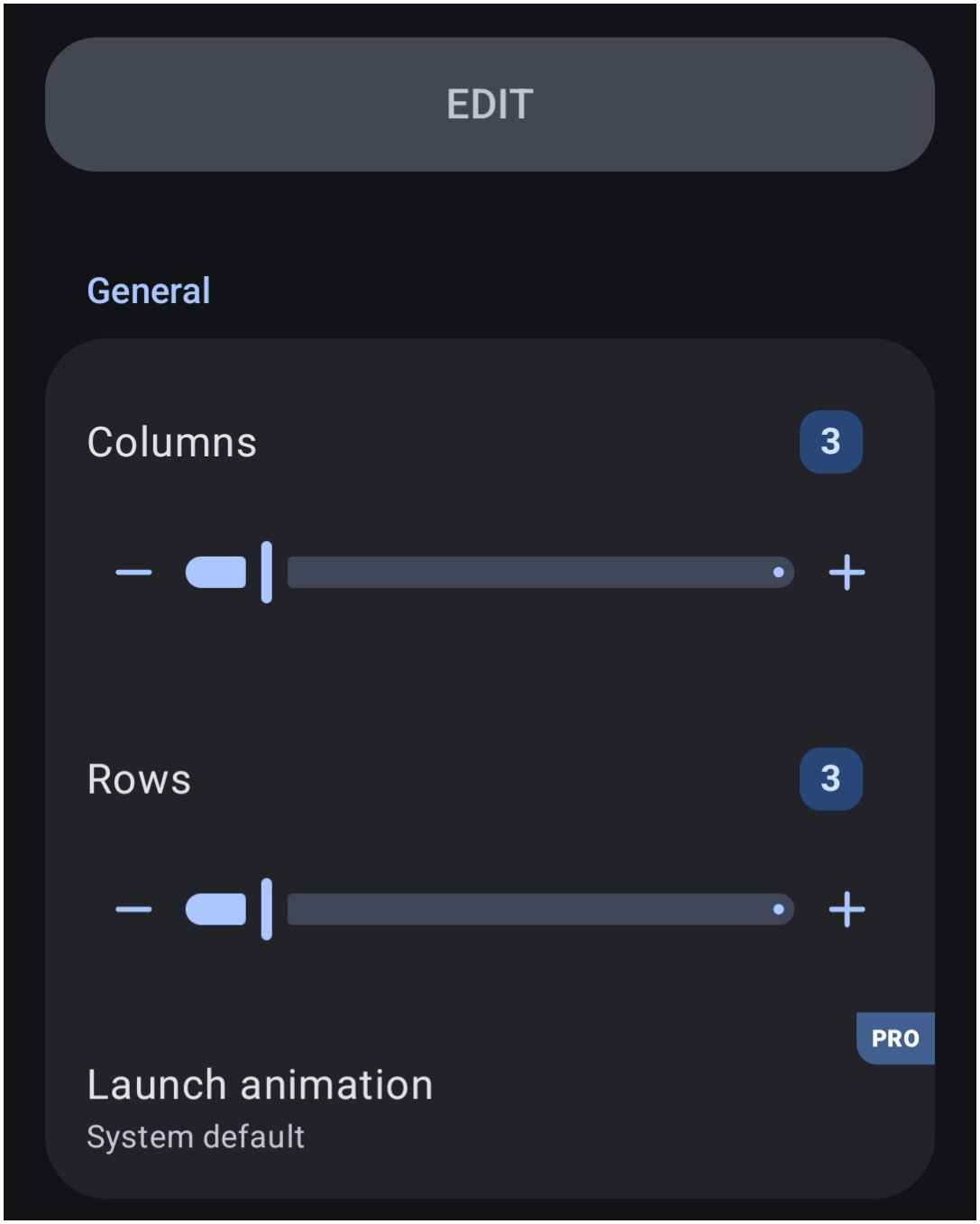
The General Options dialog controls the fixed matrix structure unique to this layout type:
- Grid:
- Columns: Defines the total number of vertical columns.
- Rows: Defines the total number of horizontal rows.
- Launch animation: Sets the animation triggered when activating an item. See here for a complete review. Note that this selection requires the
PROversion upgrade.
You could leave a comment if you were logged in.
Comments & Feedback
Toby Lancer is ready to help! Look for the Quick Help form:
► Desktop: left sidebar located near the bottom for Private to Admin
► Mobile: 3-bar menu at page top.
► Use the Discussion section below to share any experiences and communications with other Total Launcher users.
► Any Registered User can directly update this and any wiki page if desired.
Moderation: To keep the manual clean, all comments are held for appropriateness review. Preview any comment before submitting it. It will not be displayed after submission until it is reviewed. So, please, do not resubmit.
Formatting: If using any code snippets, place them inside code tags (e.g., 'code') using double single quotes (') before and after to keep them readable.
Be Kind: This is a community effort. Please keep feedback constructive and on topic.
~~DISCUSSION~~