meta data for this page
Total Launcher Grid Layout Configuration: A Guide To Customizing Icons, Labels, and Backgrounds
The Grid Layout Configuration dialog in Total Launcher provides comprehensive options for adjusting the visual presentation and interactive behavior of grid-based object groups. Modifying spatial arrangements, icon styling, typography, and background properties enables the creation of a highly functional and custom interface. This configuration menu dictates exactly how items align within a structured grid, ensuring precise control over the final design before moving into animation behaviors.
To place the grid layout on the page:
- Enter Edit Mode (Long press an empty area → Toggle Edit Mode icon) > Tap the ''Edit Off'' icon in the lower right to change it to an ''Edit On'' icon
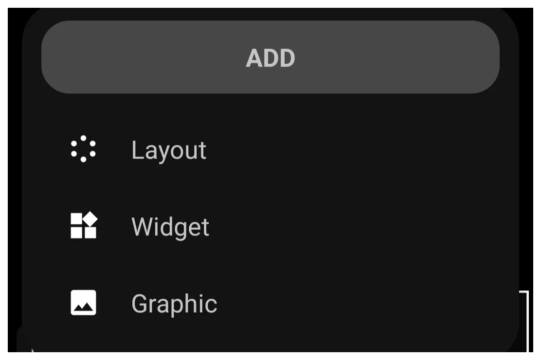
- In the Object Design menu (top) , select the Option icon to open the Add dialog . Select
Layout>Grid - The grid object with its default 6 elements is on the page, selected.



Configuration Procedure
Follow the sequence to apply modifications to the layout grid that is now on the page:
- If not currently selected, tap-hold the grid object to select it.
- In the Object Design Menu (top) select the Option icon .
- Review the menu panels indicated at the bottom of the interface.
- Select ''OPTIONS'' to modify the static parameters.
- Select ''ANIMATION'' to adjust dynamic behaviors.
- Apply the desired variable changes within the respective menus.
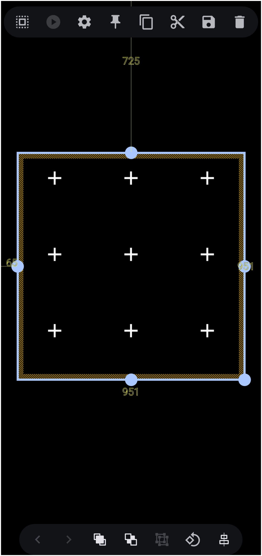

The Grid Layout Option Dialog
Options - General
Configure the arrangement and behavior of the grid container.
- Columns: - Define the number of vertical columns.
- Rows: - Define the number of horizontal rows.
- Launch animation: - Set the animation triggered upon launching an item. Note that this selection requires the
PROversion upgrade.
Options - Launch sound
Assign specific device sounds to physical interactions when the grid is activated.
- Tap: - Select the sound played upon a single tap.
- Swipe up: - Select the sound played upon an upward swipe.
- Swipe down: - Select the sound played upon a downward swipe.
- Swipe left: - Select the sound played upon a leftward swipe.
- Swipe right: - Select the sound played upon a rightward swipe.
Options - Icon
Modify the visual attributes of the icon images contained within the grid.
- Icon size: - Adjust the overall size (scale) of the icons.
- Icon padding: - Modify the internal space surrounding the icons.
- Icon opacity (%): - Adjust the transparency level of the icons, utilizing values such as
100%for solid visibility. - Icon saturation (%): - Modify the color intensity, where
100%represents natural colors and reduced values approach grayscale. - Icon color filter: - Apply a specific color overlay or tint to all icons uniformly.
Options - Label
Control the display parameters and typography of the text associated with each grid item.
- Show label: - Toggle the visibility state of the text labels to On or Off.
- Typeface: - Select the specific font family applied to the label text.
- Label lines: - Determine the maximum number of lines permitted for text wrapping, ranging from
1to3. - Font size: - Adjust the structural point size of the label text.
- Scale X (%): - Stretch or compress the text width horizontally.
- Text color: - Define the primary resting color of the text using the Launcher's Color Picker and apply a hexadecimal value such as
#FFFFFFFF.] - Text color (pressed): - Same as
Text colorabove, but changes the text color as the object is 'pressed' or tapped.
Options - Shadow
Apply drop shadows to text labels for enhanced contrast against varied backgrounds. See here for more detail on how to use Shadows.
- Shadow color: - Select the hue of the underlying text shadow.
- Shadow radius: - Control the blur, spread, or sharpness of the shadow effect.
- Shadow offset X: - Shift the shadow position along the horizontal axis.
- Shadow offset Y: - Shift the shadow position along the vertical axis.
Options - Background
Configure the container styling, individual item backgrounds, and spacing parameters.
- Background: - Set the global color or image for the entire grid container.
- Margins: - Define the external spacing outside the grid boundary, requiring specific integer values for
left,top,right, andbottom. - Item background: - Set the resting background color or image for individual grid items.
- Item background (pressed): - Set the background visual for individual grid items during a press interaction.
- Item background (focused): - Set the background visual for individual grid items when navigated to via hardware controls or focus states.
- Item spacing: - Adjust the internal gap distance between individual items placed within the grid structure.
Animation
- To be completed
Comments & Feedback
Toby Lancer is ready to help! Look for the Quick Help form:
► Desktop: left sidebar located near the bottom for Private to Admin
► Mobile: 3-bar menu at page top.
► Use the Discussion section below to share any experiences and communications with other Total Launcher users.
► Any Registered User can directly update this and any wiki page if desired.
Moderation: To keep the manual clean, all comments are held for appropriateness review. Preview any comment before submitting it. It will not be displayed after submission until it is reviewed. So, please, do not resubmit.
Formatting: If using any code snippets, place them inside code tags (e.g., 'code') using double single quotes (') before and after to keep them readable.
Be Kind: This is a community effort. Please keep feedback constructive and on topic.
~~DISCUSSION~~