meta data for this page
- en
This is an old revision of the document!
List Layout Configuration (Unique)
The List Layout in Total Launcher provides specialized options for organizing graphic objects and app shortcuts into a vertical scrolling sequence. This guide details the specific parameters found within the Options (General) tab unique to this linear arrangement type. For comprehensive instructions regarding shared global properties—including shared Icon, Label, Shadow, and Background visual configuration tabs—please refer to the primary section Layout,.
List Layout Procedure
Follow the sequence to apply modifications to the list (linear) layout that is already on the page:
-
- Tap-hold the list object to select it.
- In the Object Design Menu (top) select the Option icon .
- Review the menu panels indicated at the bottom of the interface.
- Select
OPTIONSto modify the static parameters. - Select
ANIMATIONto adjust dynamic behaviors.
- Apply the desired variable changes within the respective menus.



Unique Options (General)
The General Options panel controls the linear stack behavior unique to this layout type. Refer to  for visual context.
- Rows: Defines the total number of horizontal rows available within the list container. This setting determines the capacity of the list; increasing the count adds additional interaction slots sequentially. The range is
1to16. (Columns are fixed at 1.) - Launch animation: - Set the animation triggered upon launching an item. Note that this selection requires the
PROversion upgrade.
Launch Sound (Shared Behavior)
While present in the general options, these trigger points exist across all layout types.
- Tap, Swipe up, Swipe down, Swipe left, Swipe right: Assign device audio files to be played upon specific physical interaction types.
Assign a specific interaction to play a device sound (see Resource - Sound when any of the objects in the list layout receives that interaction.
What this means …
A sound selected for any interaction will play for all objects in the layout that receive that same interaction. For example, a tap will cause the same sound on any list item 'tapped'.
- Tap: - Select the sound played upon a single tap.
- Swipe up: - Select the sound played upon an upward swipe.
- Swipe down: - Select the sound played upon a downward swipe.
- Swipe left: - Select the sound played upon a leftward swipe.
- Swipe right: - Select the sound played upon a rightward swipe.
text
- Label: Dictates the typography for text descriptions associated with contained items. This encompasses typeface selection, vertical wrapping (Label lines), sizing, scaling, and the transition of color when an object is pressed or interacted with.
Options - Label
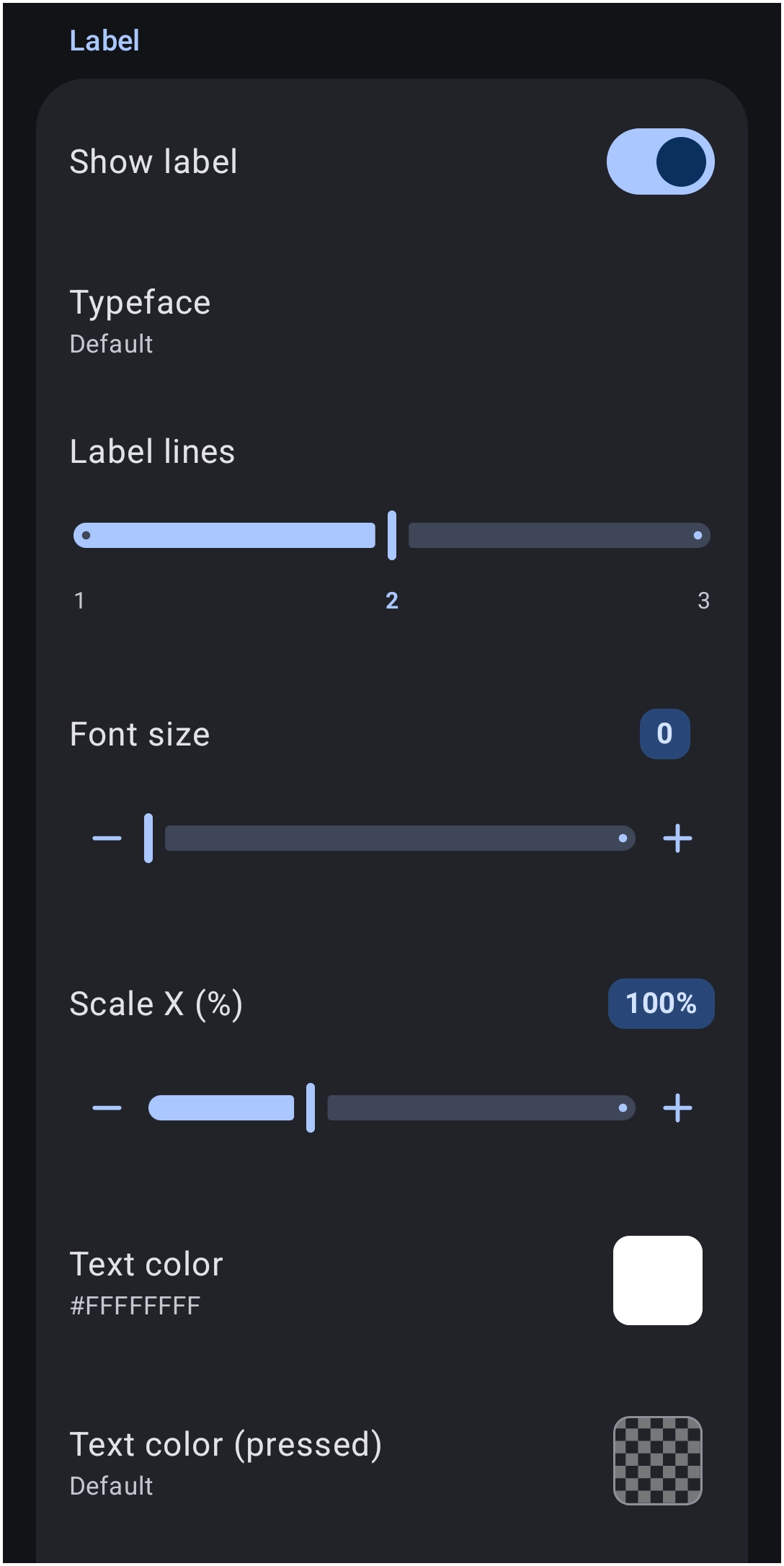
Control the display parameters and typography of the text associated with each grid item.
- Show label: - Toggle the visibility state of the text labels to On or Off.
- Typeface: - Select the specific font family applied to the label text.
- Label lines: - Determine the maximum number of lines permitted for text wrapping, ranging from
1to3. - Font size: - Adjust the structural point size of the label text.
- Scale X (%): - Stretch or compress the text width horizontally.
- Text color: - Define the primary resting color of the text using the Launcher's Color Picker and apply a hexadecimal value such as
#FFFFFFFF.] - Text color (pressed): - Same as
Text colorabove, but changes the text color as the object is 'pressed' or tapped.
Discussion