meta data for this page
- en
This is an old revision of the document!
<Withinide><!-- googleoff: index --></WRAP>
⚠️ v4.0 UI Transition Notice - In Process: The release of Total Launcher v4.0 has introduced significant user interface changes. Please note that this page does not yet reflect these updates. The new layout paths, folds, and visual maps are currently being compiled and will be deployed shortly.
<!-- googleon: index -->
Widgets
This chapter is designed to guide new and intermediate Total Launcher (TL) users on the types, functions, and customization options of widgets within the launcher environment. Widgets in Total Launcher provide both essential dynamic functionality and highly customizable wrapper containers for holding applications, windows, folders, launcher actions, application shortcuts, and system status displays.
Overview and Types of Widgets
In Total Launcher, the widget is one of the three main object categories, alongside Layout and Graphic. A widget is an individual object with an independent, specialized design and features for its specific purpose.
Total Launcher offers two primary categories of widgets:
- Built-in Widgets - created by the launcher developer
- Application Widgets - third-party Android widgets offered by applications installed on the user's device
Widget Selection Dialog
To locate this dialog, navigate to Edit On > Object Design menu (top) + > Widget. This dialog will be seen. The selections are explained below.
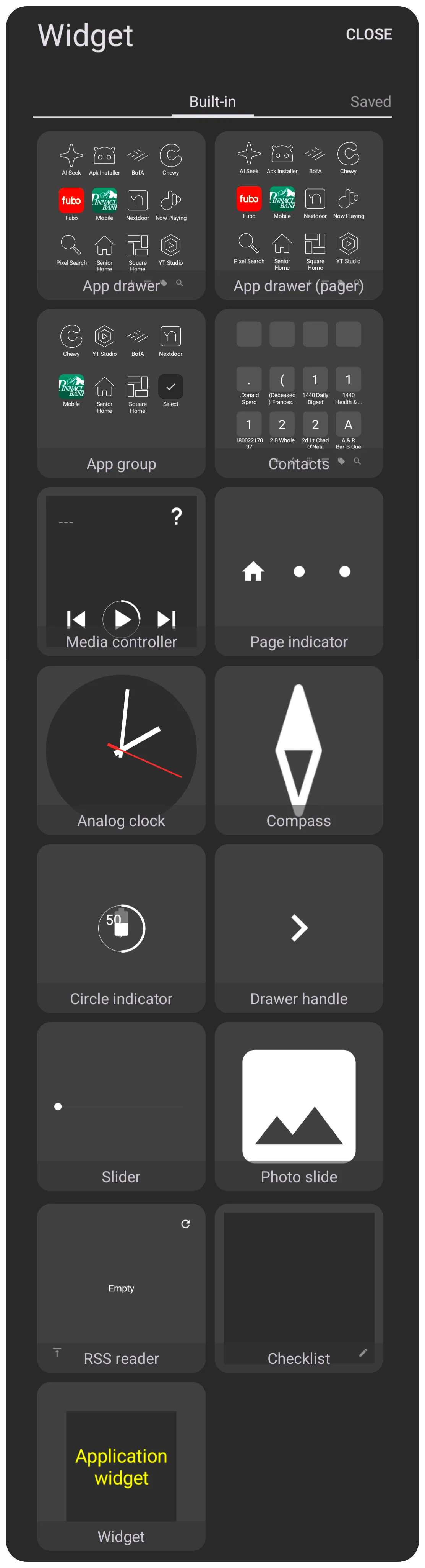
Widget - Placement and Advanced Uses
Add a Widget
To add an Application Widget, enter ''Edit On'' mode [long-press an empty area on the Page, Drawer, or Window] and select Add (+) icon  , then select
 Widget from the Add dialog list. A visual thumbnail of all widgets will display in non-alphabetical order. Application Widgets will contain only widgets for apps installed on the user's device.
Widgets can be added to a page, sliding drawer, or window. Folders will not accept widgets.
- As Floating Pop-ups - A major strength of Total Launcher is the ability to place widgets inside a window. Since a window is also known as a “pop-up (floating) page,” this allows widgets to appear anywhere on the screen via gestures, shortcuts or even hidden (transparent) until an action-on-tap is activated on a page area.
- Scrolling - Windows themselves cannot be made scrollable, but widgets such as an App Drawer or a specific 3rd party widget like an RSS reader (placed within them) which have native scrolling functionality will scroll correctly.
- Widget Stacking - Multiple windows can stack widgets on top of one another. This allows users to “switch” between different widgets (like weather and calendar) by creating a transparent image/graphic object as the action trigger to open one window and close another.
Widget - Built-in
There are fourteen built-in widgets in Total Launcher:
- **App Drawer** (jump to full discussion) displays applications installed on the device, often functioning as a comprehensive app group with highly customizable layout, grid/list or columns/rows with various sorting options such as
- default as controlled by main menu > launcher options > behavior > app drawer section
- smart based on frequency of use, time of day, and other smart measures
- user defined
- name
- offers a full menu bar
- **App Drawer (pager)** (jump to full discussion) is a newer type of app drawer widget which scrolls horizontally. It does have differences from the app drawer widget.
- **App Group** (jump to full discussion) functions similarly to the App Drawer but allows for grouping its items (apps, windows, folders, shortcuts) by user-defined criteria (mostly folders). It offers a customizable layout, icons, labels, and background.
- **Contacts** (jump to full discussion) displays user contacts, based on the device's contact manager, and can be set to grid or list type. It supports long-click calls and allows setting a default graphic for items without a photo.
- **Media Controller** (jump to full discussion) provides controls for a media application which supports the Android Media Controller API (e.g., Google Music, Poweramp). It also allows selecting a target app, customizing control button size, text size/color, icon color, and using a foreground image (skin). It can display the currently running media app even if a specific target app is not selected.
- **Page Indicator** (jump to full discussion) shows the user's current position (here a 15 page setup) within the setup pages and can use customizable images or colors for normal, current, and home pages.
- **Analog Clock** (jump to full discussion) displays the time and allows setting a time zone and customizing the appearance of the hour hand, minute hand, and second hand (which can be hidden using a transparent color).
- **Compass** (jump to full discussion) displays a compass functionality. It provides a basic image of the compass needle (skin) and supports applying a color filter to that skin.
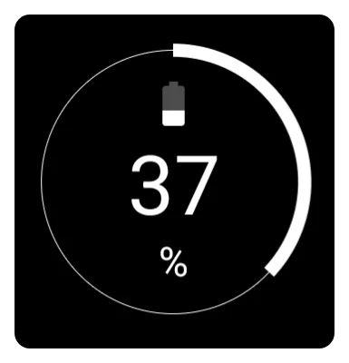
- **Circle Indicator** (jump to full discussion) shows the current status for a selected resource such as battery, RAM usage, storage, or SD card usage.
- **Drawer Handle** (jump to full discussion) creates an expanded trigger area to pull out a specific sliding drawer (left, right, top, or bottom). It requires selecting the target sliding drawer and can use a custom image instead of the default arrow icon.
- **Slider** (jump to full discussion) offers on-screen control of screen brightness or volumes (media, ring, notification, alarm, or call)
- *Photo Slide** (jump to full discussion) is a photo show wrapper container to sequentially or randomly display images in color or force grayscale from a designated folder in user-selected intervals. The container's skin and corner radius can be modified.
- **RSS reader** (jump to full discussion) or Really Simple Syndication for news, podcasts, other channels or aggregation services. The container will support both images with text and text-only, depending on the aggregator's setup. It accepts standard URLs with an unverified number of available slots (up to 20 have been tested).
- **Checklist** (jump to full discussion) is a widget to help users manage and track tasks. It offers manual addition, editing, and sorting.
- **Application** - (jump to full discussion) Every device has 3rd party application for varying purposes, and application developers frequently offer to present their app's data in a customized format. If selected by the user in this dialog, Total Launcher extracts the container and provides placement for the user and some additional customization.
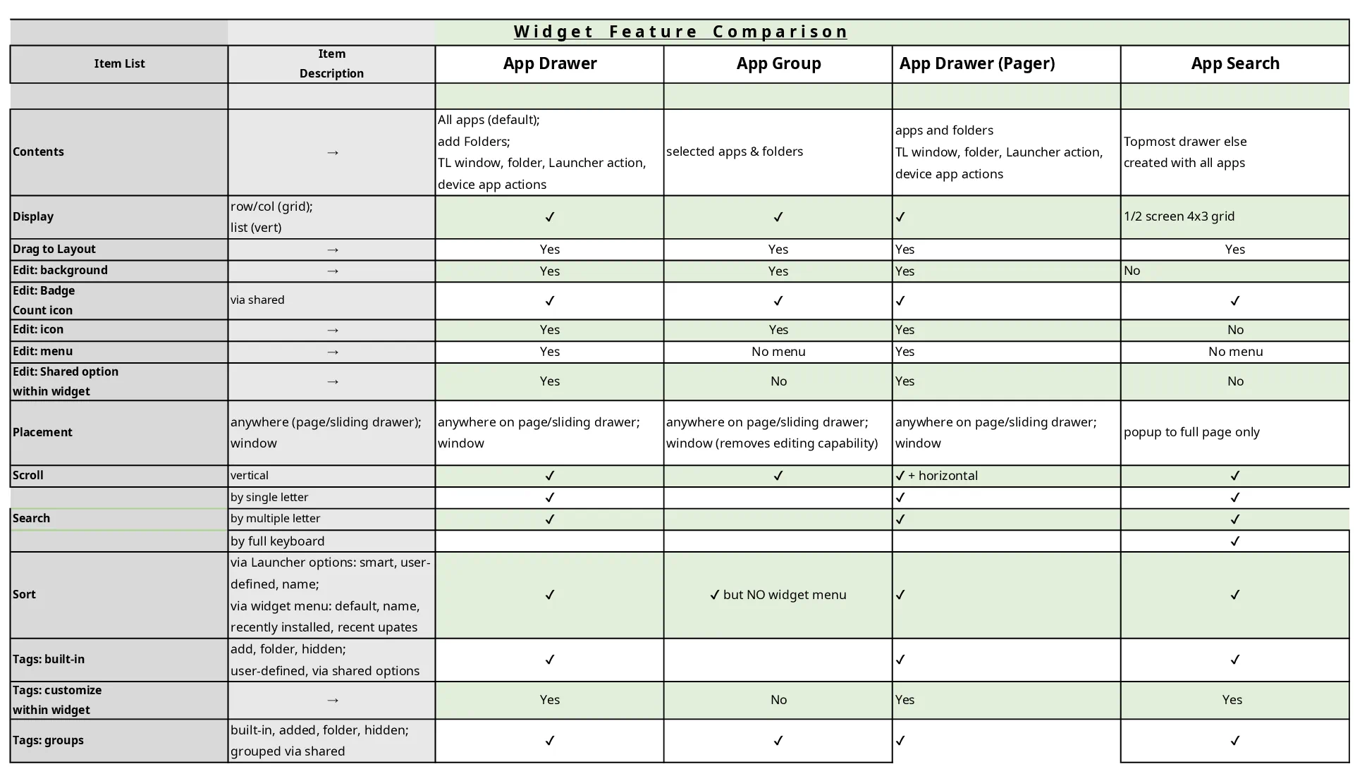
Below is a more detailed discussion of each built-in widget. Understanding the differences between similar widgets, such as App Drawer, App Drawer (pager), App Group, and Contacts, is difficult. If the descriptions below still leave questions, this spreadsheet representation may be more helpful for those interested.
Widget: App Drawer
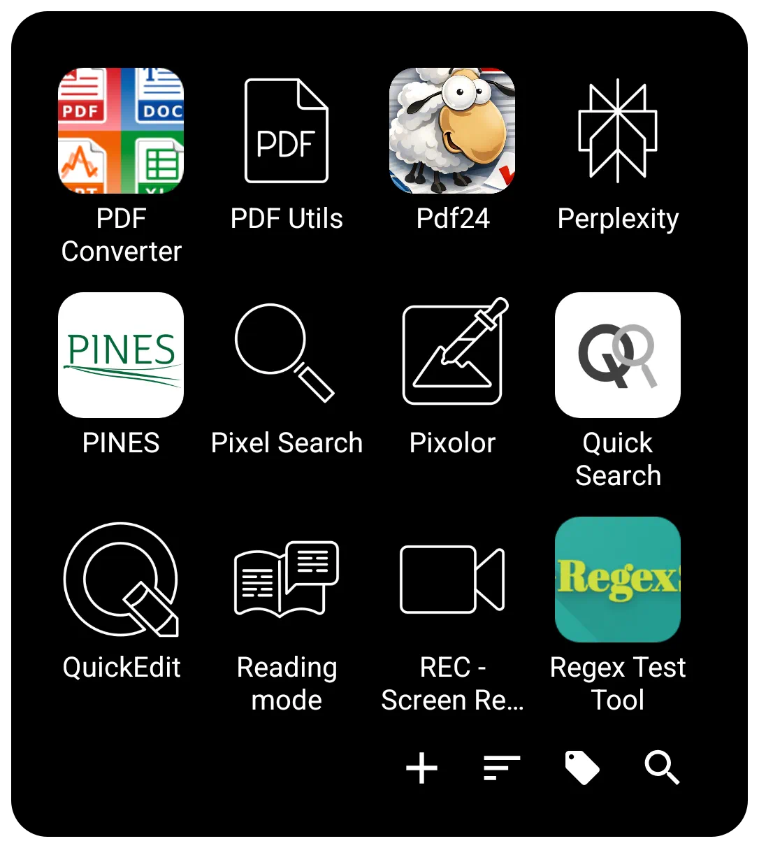 | The App Drawer widget is critical for advanced setup customization, offering flexibility in how apps are accessed. It can be placed directly on a page, within a window (to create a floating pop-up app drawer), or anchored to a screen edge (simulating a sliding drawer). |
Interaction & Navigation
The bottom Menu Bar 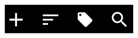 of the widget is the control center for finding and organizing apps. It contains the Add, Sort, Tag, and Search icons.
To customize the visual appearance of this bar (background, icon sets, text color/typeface), enter Edit On > select the App drawer (highlight) > select Object Design Menu (top)  >
> Options  .
.
Search
The Search icon  on the bottom menu bar offers two modes:
- Index Search - Offers a selection of initial letters, numbers, or special characters to jump to specific items.
- Keyboard Search - The 3-dot icon
 at the bottom opens a full keyboard search.
 - Folder Support - Search can optionally include items contained inside folders. Toggle this via
Main Menu>Launcher Options>Behavior>Search in folder.

Creating a Custom Search Window
To fully customize the search experience (position, background, font), create a Window containing an App Drawer widget. Set the window's Action on open to Launcher Action > App search or Contact search. This forces the keyboard to open immediately when the window launches.
See App & Contact - Search Customization for details.\
Sorting
The Menu Bar allows a managed Sort  icon on the menu bar.
- Temporary Sorting: Sort momentarily by Name, Recently installed, or Recent updates.
- Persistent Sorting: Defined in the widget's Shared Options \> Sort order. Options include:
- Name - Alphabetical.
- User Defined -Allows manual rearrangement of apps and folders in Edit Mode.
- Smart - Ranks items based on usage patterns (time of day, location, headset status, etc.). The number of “smart picks” can be set from 1 to 25.
- Tags
 - This allows users to group applications.
- Built-in Tags - Includes categories such as Productivity, Folder, and Hidden. Additional categories (Maps, News, Social, Games, etc.) can be enabled via
Main Menu\>Launcher Options\>Behavior\>Built-in tags. - Untagged Items - An option exists to display only items that have no tag assigned.

Visual Design
The design options are, again, available once the widget is selected and the Option icon is tapped.
Layout & Scrolling
- View Type - Toggle between Grid type (customizable columns/rows from 1 to 16) or List type (vertical list with icon and name).
- Scrolling - Behavior is vertical. Options include System scroll animation, Snap scroll (prevents items from being cut off), Hide scrollbar, or Quick scroll (see demo here

Widgets placed in windows that have native scrolling will retain their own internal scrolling characteristics.
Item Aesthetics (Icons & Labels)
Users have detailed control over the visual presentation of apps. These can be applied globally via the Shared Options tab.
- Icon Customization
- Size & Padding - Adjust pixel size and margins (padding).
- Effects - Adjust Opacity, Saturation (0% = grayscale), or apply a Color Filter (overlay).
- Dragging - Individual icons within the widget can be dragged out and dropped onto a page layout.
- Label Customization
- Text - Toggle Show label on/off, select Typeface, and adjust Font size.
- Scaling - Scale X(%) controls the horizontal spread of the text.
- Shadows - Configurable Shadow color, Radius (depth), and Offset X/Y (direction).
Backgrounds & Menu Bar
- Widget Background - The overall background of the drawer.
- Menu Bar - Specific background for the bar as well as individual bar object icons, menu typeface, and color.
Transparency Trick:
Users can set a color in the color dialog using a hex code #00000000 to make an element transparent (hidden) while keeping the item functional.
Animation & Badges
- Launch Animation - Located in the Edit dialog, this controls the effect when the app opens. Options include
System default,No animation,Fast,Fade in,Popup, or directional slides (Flying to/Sliding from).
- Badge Counts - A visual indicator (a red circle with a number) that shows the number of unread notifications or new items waiting for the user in the specific app. These can be customized directly within the widget's Shared Options.
VERIFY THIS COMMENT: do badges show on App Drawer and not App Group? Check your phone … then adjust this … This differs from the App Group, which displays badges, but customization is handled only system-wide via
Main Menu>Launcher Options>Icon Style>Badge Count.
Widget: App Drawer (pager)
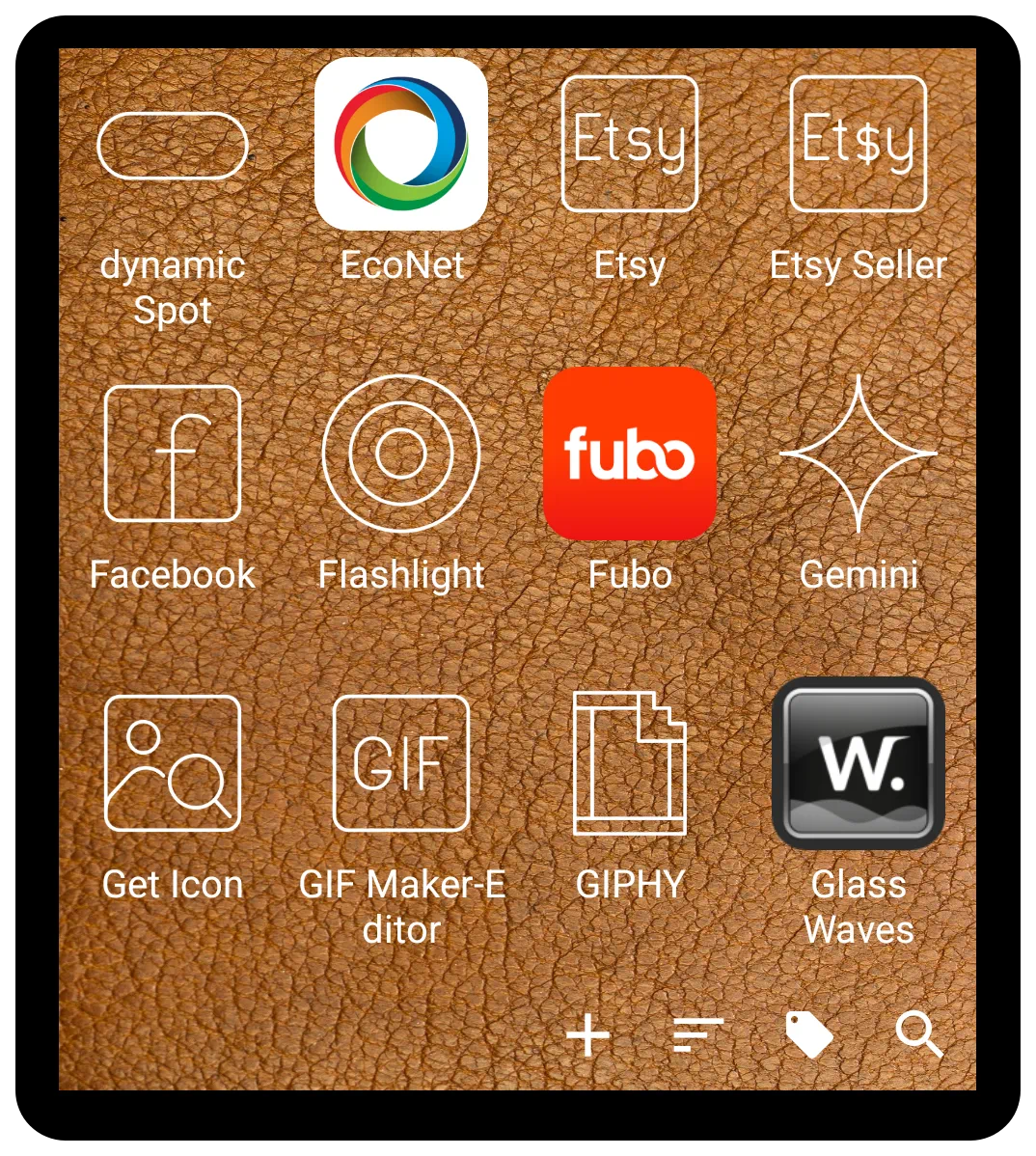 | The App drawer (pager) is a distinct, built-in widget that offers an alternative to the standard 'App drawer' for displaying and organizing applications. It is designed as a customizable container that holds user-selected apps and folders, featuring either vertical or horizontal scrolling. Its primary difference lies in its presentation and built-in functionalities, which can provide a more structured and efficient user experience. |
The App drawer (pager) can be accessed and added by entering Edit Mode > the Add icon (+) > Widget, then navigating the list of built-in widgets and selecting it.
Key Differences and Benefits
While the standard “App drawer” is highly customizable, the App drawer (pager) widget provides a different structural approach and unique features. A user may prefer this format for the following reasons:
- Paging versus Scrolling: The fundamental difference is the paginated layout. Instead of a single continuous list, applications are organized across distinct pages that are navigated with a swipe. This can improve organization by allowing users to group apps by category or frequency of use on separate pages.
- Built-in Search Functionality: The 'App drawer (pager)' widget includes an integrated app search feature. This provides a significant advantage for users who want to quickly find an application without scrolling through pages or returning to the home screen to use a separate search widget.
- Display Customization: This widget allows for specific display configurations that differ from the standard drawer.
- An option exists to display applications as a text-only list, without icons. This is beneficial for users seeking a minimal and clean interface.
- Sorting Options: It can be configured to show the most recently used applications at the top of the list, providing quicker access to frequently opened apps.
Widget: App Group
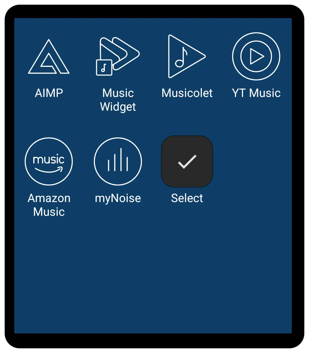 | The App Group shares many core customization and aesthetic features with the App Drawer widget but does have some differences noted below. It allows users to create specific groups, which makes it ideal for creating static docks, categorized groups (like “Work Apps” or “Games”), or quick-access panels, rather than displaying all applications on the device (which is the primary function of the App Drawer). |
Customizable Application Container
The App Group widget is primarily used to display a focused selection of icons, relying heavily on user organization and selection. This selection can include applications, windows, folders, or shortcuts.
Functions and Tagging
The fundamental purpose of the App Group is to act as a grouping container as determined by the user. Once set by the user, it will not automatically update.
- Tagging: App Group differs from App Drawer in that tagging is not available within the drawer since there is no menu system. Tagging can still be done through the App Drawer but cannot be set anew within the App Group. This should not be a significant loss when deciding to use this widget, since the quasi-tag system by group already populates the widget with the desired objects/folders.
Layout and Display
The App Group widget provides extensive control over its layout, supporting both grid and list formats:
- Layout Type: The widget can be toggled between Grid type or List type.
- Grid Dimensions: When set to Grid type, users can define the number of Columns (ranging from 1 to 16) and Rows (ranging from 1 to 16) to fit the required space on the page, window, or sliding drawer.
*Scrolling: The layout supports vertical scrolling, which is essential for displaying numerous items. Users can customize the scrolling experience using options such as system scroll animation, snap scroll (to ensure items settle without being cut off), and hide scrollbar. Notably, the App Group currently does not support horizontal scrolling (paging) like the specialized App Drawer (pager).
- Menu: Search, Tag, Sort: No menu system for tag, search, or sort is available.
Customization Highlights
App Group shares the rich visual customization settings found in the App Drawer when in Edit On mode and selected:
- Aesthetics: Customization is accessed by selecting the widget and tapping the Options icon (gear) in the top menu bar.
- Icon Settings: Detailed control over icon appearance is provided, including adjustment of Icon size, Icon opacity(%), Icon saturation(%) (to control color intensity), Icon padding (margins around the icon as a percentage of size), and applying an Icon color filter.
- Shared Options: There is no Shared Options tab in the Option Edit dialog. See below for options which are editable within the widget.
- Label Settings: The label (the text beneath the icon) can be enabled or disabled. Further control includes choosing the Typeface (font), setting the Font size, and modifying the horizontal spread using Scale X(%). Shadow effects for the label are also available through settings such as Shadow color, Shadow radius, and Shadow offset X/Y.
- Background and Spacing: The appearance of the container and the items within it can be fully customized, including setting the overall widget Background and background for individual items (Item background, Item background (pressed), Item background (focused)). Users can also manage spacing using Margins around the widget and Item spacing between the icons. If no margins or spacing are set, items may fill the entire grid area, covering the main widget background color.
- Animation
- Enter Animation: This is a widget animation which occurs when returning to the page occupied by the widget.
- See more detailed discussion here.
Widget: Contacts
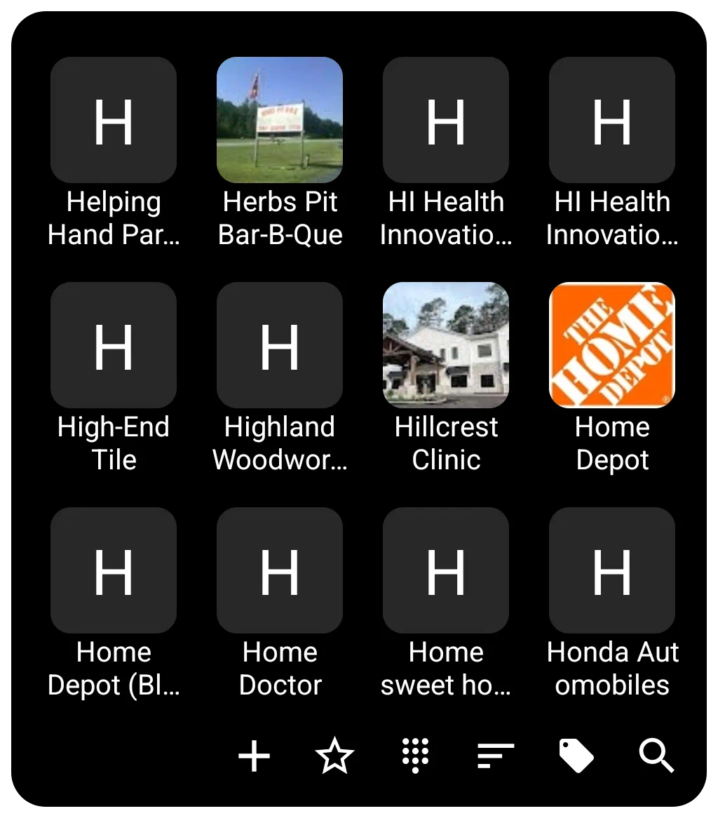 | Contacts widget functions as a specialized container for displaying user contacts with extensive customization options for appearance, layout, and interaction as discussed below. |
General Functions and Filtering
The Contacts widget can operate in either a Grid or List format. Switching off the “Grid type” option makes it a list view.
- Content Display: By default, it displays all contacts, or can be restricted to display only contacts with a phone number by turning off the Show even if no number option.
- Grouping: The widget supports contact groups based on the device service's tagging categories. This grouping can be turned on/off in the widget options.
- Layout: When using the Grid type, the user can customize the layout by setting the number of Columns and Rows. If grid is set to off, the display will list the contacts in a single column. See below for sorting options.
- Sorting/Interaction: The widget supports Family name first ordering, which is applicable to Western style names. If not selected, it defaults to first name.
- Dialing: Direct calling by Long-click call to the contact's default number is available. This means tapping and holding the contact's image/number initiates a call if the user has previously granted the launcher permission to access the phone. Just a single tap will open the contact data page in the phone app.
Image and Photo Handling
The Contacts widget integrates photos associated with contacts through the system contact manager.
- Photo: The photo shown for each contact defaults to the one in the contact app. If a contact item does not have a photo associated with it, the contact image defaults to an icon with a single capital letter of the contact's name based on sorting order. The user can set a Default photo within the widget's options for a user-selected icon, image, color, dynamic color, or shape to be used for all contacts lacking a contact app photo.
- Aesthetics: The size and spacing of the displayed contact icons/images are adjustable via icon size (in pixels) and icon padding (margins around the icon expressed as a percentage of icon size) and icon rounded corner.
Customization Details
Customization options for the Contacts widget are accessed via the options button (gear icon) while the widget is selected in Edit Mode.
- Layout and Scrolling
- The widget supports features for smooth navigation, including turning on system scroll animation.
- Snap scroll ensures that items are not cut off on the top or bottom when the scrolling motion settles.
- Quick scroll brings up a vertical alphabet the user can slide through to reach the contact area when the left or right widget edges are pressed and held. Quick action by the user is necessary; otherwise, the scroll will advance automatically.
- The scrollbar on the right side can be hidden using the hide scrollbar option.
- Labels (Text)
- Labels can be hidden by turning off Show label.
- Customization includes selecting the typeface (font), adjusting the font size, and modifying the horizontal spread using scale X(%).
- Text color and shadow effects of shadow color, shadow radius (depth of the shadow), and shadow offset X/Y (the horizontal and vertical direction of the shadow) are fully configurable.
- Label lines setting determines the number of lines available for the label (1 to 3).
- Background
- Background setting will provide for complete color, dynamic color, icon pack, shape, image, or dynamic image selection.
- The background for individual items (item background), including states when pressed or focused (item background (pressed) and item background (focused)), can also be customized as covered in the general background above.
- The distance between items is controlled by Item spacing (in pixels).
- See Background for more details if desired.
- Margins in this widget apply to the manageable space within the Contact container's 4 boundaries.
- See Understanding Margins in Total Launcher for a full explanation of how margins for simple objects (icon, text, image) may differ from container objects (folder, sliding drawer, widget, window) and how Total Launcher's “Item spacing” (aka “padding”) plays a part in visual appearance.
- Menu Bar
- The bottom menu bar used for controlling the widget contents is highly customizable in terms of color, dynamic color, icon pack, shape, and image. The appearance of text on the menu bar is adjustable via menu text color (can be invisible if desired) and menu text typeface.
- Menu bar elements include: (not discussed individually are add icon, star on icon, star off icon, dial icon, sort icon, group icon, search icon, and clear menu icon
- Menu background is customizable in the same manner as Contact container background discussed above.
- Animation
- Enter animation for the Contacts widget actually occurs when the user completes a call and returns to the open Contact widget.
- See Page and Object Animation and UI Object Animation for an overview of animations available.
Widget: Media Controller
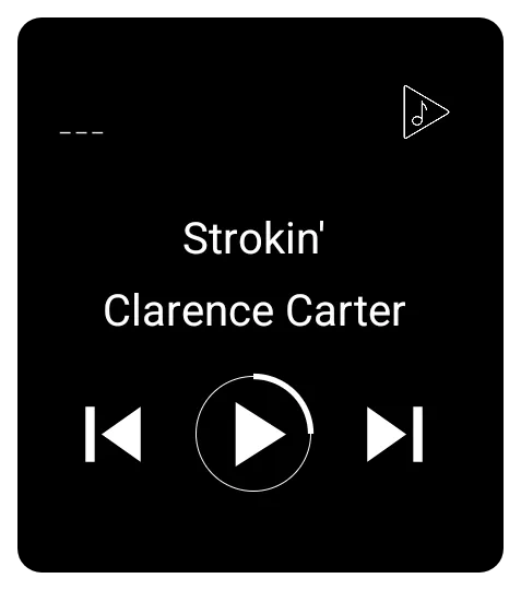 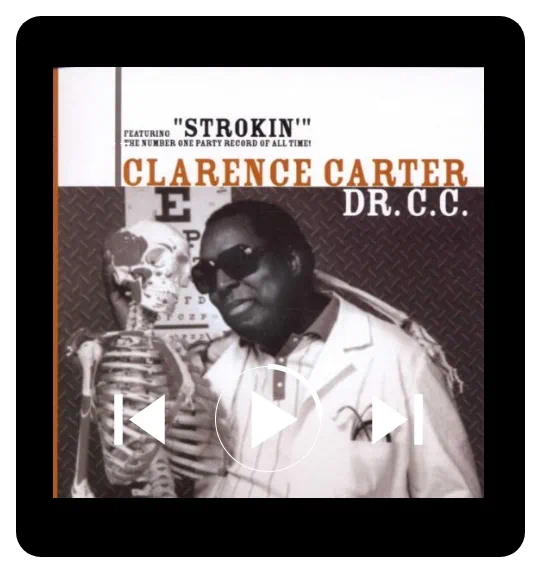 | This controls a media application and specifically works with media player apps that adhere to the MediaController API of the Android framework. Rather than attempting to list compatible media players, if the widget does not perform, the user should determine whether the media player meets this criterion. The Media Controller displays a set of controls (buttons) along with media metadata (title and artist) and album art for managing audio or video playback. |
Key Functions and Configuration
Configuration for the Media Controller is handled through its dedicated options menu:
- Target Application: Users can specify the target application (on the user's device) for the widget to control.
- Control Box Size: Sets the height of the control buttons, measured in pixels.
- Control Box Offset: Adjusts the vertical positioning of the controls.
- Hide on no session: If checked, this setting will remove the widget from the screen. Conversely, the widget will “pop up” when the target player starts.
Visual Customization
The Media Controller offers detailed options for customizing its appearance:
- Metadata Text: Text size (in pixels), text color, and typeface control the appearance of the title and artist displayed by the controller.
- Control Icons: control buttons and the playing animation icon color is controlled by icon color setting
- Skin (Foreground Image): This foreground image covers the album art and text but is layered to lay under the control button
- Container Aesthetics:
- Like other built-in widgets, the Media Controller allows customization of the Background and Margins.
- If a background is used, the album area is replaced.
- The rounded corner radius setting allows the widget container modification from a 90-degree corner to a circle.
Want to disable the music widget's animation?
After adding the widget, long-press to open the widget settings and toggle album art on/off.
Widget: Page indicator
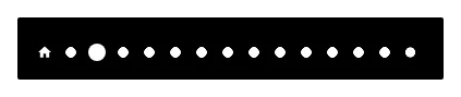 | The widget serves as a visual aid to show the current location within the setup's available pages. The default page indicator consists of a “house” image representing the home page, and multiple dots for setups with more than one page, all in white. (The image shown is for a 15-page setup.) As a user's action causes the viewable page to change, the indicator representing the current page will enlarge slightly. This means each indicator (page) has 2 states: • focused -or- current • unfocused -or- available but not being viewed |
Customization and States
Customization options are accessed by selecting the widget (press and hold it in Edit Mode On) and tapping the Options icon (cog wheel) in the object design menu at the top of the screen.
All customization for the page indicator elements uses the widget's Edit dialog, which opens the launcher's standard Edit dialog, consisting of Reset, Color, Dynamic color, Icon pack, Shape, Image, and Dynamic image. These options are fully discussed here.
For the Page indicator function, the above customizations are accessed by selecting the specific element of the indicator to modify:
- Background: The background of the widget itself
- Page (current): The page dot/marker indicating the current page the user is viewing.
- Page (normal): The page dot/marker either preceding or following the currently viewed page (i.e., not the active page).
- Home (current): The page dot/marker when the page being viewed is the designated home page.
- Home (normal): The page dot/marker of the designated home page when the home page is not being viewed.
- The “home page” is user-designated in the Page Edit dialog as shown here.
Widget: Analog clock
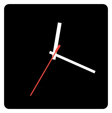 | This functions as a clock face, displaying time with hour, minute, and second hands. |
Customization and Features
All customization for the analog clock elements uses the widget's Edit dialog, which opens the launcher's standard Edit dialog, consisting of Reset, Color, Dynamic color, Icon pack, Shape, Image, and Dynamic image. These options are fully discussed here. The features to be customized with the above options are:
- Time Zone: Users can set the specific time zone the clock is to display, which defaults to the user's device setting. The user can manually select from over 500 locations in the global time zones.
- Clock Hand Customization: The appearance of each clock hand is individually configurable:
- Hour hand: Most users will customize this using a color or image. The hour hand can be made invisible (hidden) using the hex color code
#00000000. - Minute hand: See the above hour hand discussion.
- Second hand: See the above hour hand discussion.
- Aesthetics
- Background: The overall background of the widget would be the clock face. Users should find suitable images to import into Resource Images in the launcher for customization.
- The default background is transparent but can be modified with any of the six options above.
- Margins: The margins default to 5 pixels on all sides. An increase in the margins on all sides would reduce the space available for the hands, making them occupy less space. Also, manipulation of the margins could be used as an offset to shift the center point (fulcrum). The margin modification does not affect the background display.
- Animation
- Enter animation for the analog clock widget. See more discussion on enter animation here.
- If the clock is on the designated home page and the phone is on the home page, the enter animation is affected after a system doze and “awakened” by the power button or phone unlock.
- Returning to home screen from exiting 'recent apps', enter animation activates.
- 'Quick Exit' swipe: swiping up from bottom navigation bar wipes the immediate app to backround and brings forth the home screen, in which enter animation also activates, creating a clean transition.
- Fixme … hopefully, some creative soul will insert another way that this is used or useful!
Widget: Compass
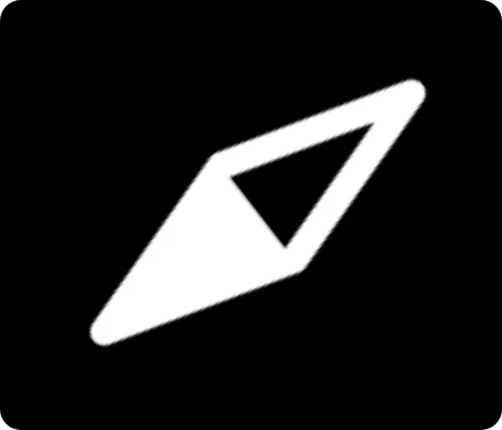 | The Compass provides directional functionality. |
All customization for compass elements has access to the widget's Edit dialog, which accesses the launcher's Edit dialog, in the following manner:
- Compass skin
- Reset
- Icon pack
- Shape
- Image
- Color filter
- Reset
- Color
- Dynamic color
- Background
- Reset - Returns to the previous setting and saves no changes.
- Color
- Dynamic color
- Icon pack
- Shape
- Image
- Dynamic image
These options, discussed below, allow users to fully define the visual appearance of the directional elements and the container itself:
- Compass skin: This critical setting defines “an image for the compass skin” or more commonly known as the needle, where a user can substitute a user-selected graphic for the default needle or display.
- Icon pack - Icons could, if appropriate, serve as a compass needle. These would be from the user's device or the Play Store. See here.
- Shape - Easily, a user-specific shape could be customized. See here.
- Image - Be creative in selecting an image for the compass needle. North is the top of the image! See here.
- Color: A color can be applied to filter (draw over the skin) the image, providing control over the final appearance of the compass graphic. If using a color, an opaque selection will obscure the skin, whereas a transparent selection (where the # begins with
00through99) would cover the compass needle. This uses the launcher's Color Picker utility shown here. - Background: The background of the widget can be customized.
- The default background is transparent but can be modified with any of the six options shown above.
- Margins: The margins default to 0 pixels on all sides. Any increase in the margins on all sides would reduce the space available for the skin/needle, allowing it to occupy less space. Also, manipulation of the margins could be used as an offset to shift the skin/needle position. The margin modification does not affect the background display.
- Animation
- Enter animation for the analog clock widget. See Page and Object Animation and UI Object Animation for an overview of animations available.
- If the compass is on the designated home page and the phone is viewing on the home page, the enter animation is effected after a system doze and “awakened” by the power button or phone unlock.
- Fixme … hopefully, some creative soul will insert another way that this is used or useful!
Widget: Circle indicator
| Device resource | Data Value | Image |
|---|---|---|
| • Battery | % available | 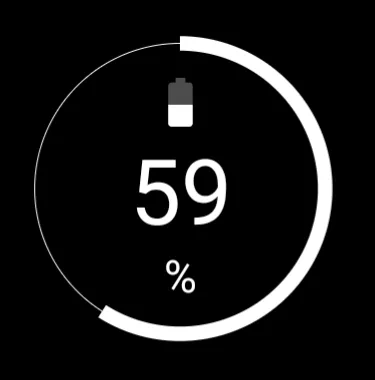 |
| • RAM usage | % available | 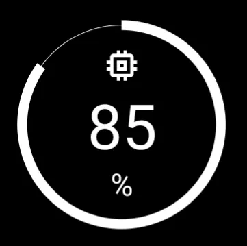 |
| • Storage (internal storage) | % available | 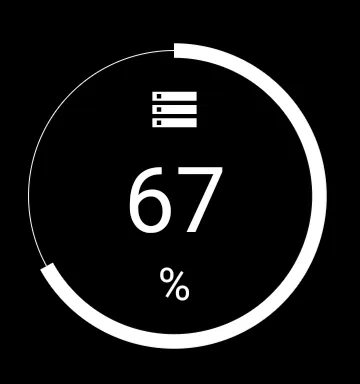 |
| • SD card | % available (if inserted) | 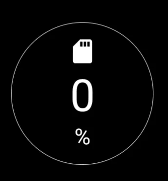 |
| The Circle indicator displays the current status of a specific device resource in a visual, circular format. | ||
Key Functions and Customization
The Circle indicator configuration allows users to select which system data is represented and how the indicator is displayed. The selection of which data value to present is made in the Target option of the dialog.
Customization options for the widget container and indicator appearance are:
- Color - Sets the color of the displayed graphic elements using either the launcher's Color Picker utility or Dynamic Colors. Learn about the dynamic color scheme here.
- Background - Defines the background selections (color, dynamic color, icon pack, shape, image and dynamic image) for the widget container. See Background for more details if desired.
- Margins: Allows adjustment of the margins surrounding the widget in its container. See Understanding Margins in Total Launcher.
Widget: Drawer handle
 | This serves as an expanded trigger area to pull out a specific sliding drawer which is particularly useful if the default used by Total Launcher (a narrow invisible trigger area on the edge of the screen) is deemed too narrow or not accessible. Total Launcher supports four sliding drawers (left, right, top, and bottom). |
Customization and Configuration
The customization options for the drawer handle widget are specific to its function of linking to a sliding drawer and styling the trigger element.
- Target: This setting specifies A sliding drawer which this widget works for. The user will select the specific sliding drawer the handle will activate: • left • right • top • bottom
- Image: Select a substitute for the default chevron (<∧>∨) in these launcher resources:
- Color filter: A color can be set to draw over the drawer handle. This uses the launcher's Color Picker described here.
- Background: Defines the background selections (color, dynamic color, icon pack, shape, image and dynamic image) for the widget container. See Background for more details if desired.
- Margins: Allows adjustment of the margins surrounding the widget container. See here.
Widget: Slider
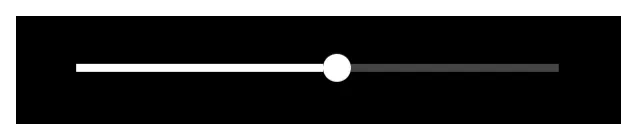 | Offering on-screen control of screen brightness and volume (media, ring, notification, alarm, or call) through a linear representation with a “thumb” or bulb indicating the current point within the target's data range. |
Key Functions and Customization
The default slider is basic. A horizontal line with a “thumb” or bulb that can be grabbed and slid for adjustment. All visual aspects of this object can be modified in the widget's edit dialog:
- Control - Select the specific target to control shown below. All target measures are visual adjustments along a predetermined length (which itself can be scaled), but there are noranges offered.
- Screen brightness - The device's surface illumination
- Media volume - the music, videos, games, and other multimedia applications
- Ring volume - if the device has phone capabilities, the volume of the ring
- Notification volume - the master control for all sounds used in notifications. If the user device has individual notification volume settings, this will override that setting for immediate control.
- Alarm volume - Master control for any application which utilizes the “alarm” setting
- Call volume - If the device has phone capabilities, the speaker volume during a call.
- Thumb size - This is the bulb or solid circle (default) representing the current point within the range. Size range is 0 - 287.
- Thumb skin - This is the bulb or solid circle (default) which can be user-replaced
- Track thickness - The thickness of the line along which the thumb (bulb) will travel. Thickness range is 0 - 287.
- Track color - The visible color of the portion of the track to the right of the thumb position. Some may call this “unused capacity”. This is through Color or Dynamic Color.
- Progress color - The visible color of the portion of the track to the left of the thumb position, set via Color or Dynamic Color.
- Background - Defines the background selections (color, dynamic color, icon pack, shape, image and dynamic image) for the widget container. See Background for more details if desired.
- Margins: Allows adjustment of the margins surrounding the widget in its container. See here for a better understanding.
Widget: Photo slide
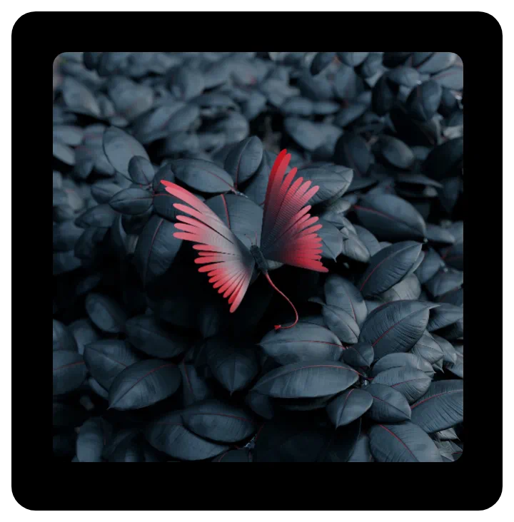 | A slideshow of sequential or random images from a designated folder, displayed at user-selected intervals. and customization options (such as grayscale or corner radius). |
Key Functions and Customization
uiTLM has successfully tested these types ot images support:
- .bmp
- .gif
- .ico
- .jpeg
- .jpg
- .png
- .webp
Customization features available in the widgets Edit dialog are:
- Photo folder - User-selectable folder on the device
- Change interval (sec) - Image will sequence within a user-selected range of 6 seconds to 60 seconds
- Skin - The skin is the actual viewing area of the container, making this option questionable. A best use is with a highly transparent color or shape with color to give the image a consistent or gradient hue. The Icon pack option could be used as a “logo,” but any insert will be centered and is not movable.
- Rounded corner radius - The widget's container defaults to a square but can be resized by tap-hold and grab. The user can choose to round corners by selecting a desired radius, ranging from 0 (square) to 300 (circle). Again, the diameter can be adjusted, even making an ellipse.
- Disable 3D animation - This option disables the default presentation of images in 3D animation consisting of randomly selected launcher animations such as cube, sliding (4 directions), flip, and more. Images will only change by sliding in four random directions.
- Keep photo centered - This keeps all images (some peripheral objects may not be shown), while the default shows images larger than the widget's container in a pan-type view randomly roaming the full image.
- Random pick - Presentation of images defaults to the directory's alpha-numerical order. Activating this option will cause random viewing.
- Grayscale - This option, if activated, displays each image as a gray-scaled image.
- Background - This offers the generic Background options of the launcher, which is of questionable use since the image itself occupies the full container. However, using Color in a transparent format (where
Aof ARGB is00) may provide an acceptable tint to the images shown. See here. - Margins: Allows adjustment of the margins surrounding the widget in its container. See here.
Widget: RSS reader
 | An RSS reader integrates _R_eally _S_imple _S_yndication feeds (for news, podcasts, or aggregated channels) through any RSS service. The reader supports the display and content of user-selected services (3 are included, but a user can search for rss sports or rss podcasts etc), which can include images with text or text-only layouts. |
Functional Characteristics
Toby says: Scroll with RSS in Windows!
• Scrolling in Windows: Although windows themselves do not scroll their contents, widgets placed inside a window that possess native scrolling functionality will scroll correctly. This allows users to view long news feeds within a floating pop-up window or sliding panel.
Widget: Checklist
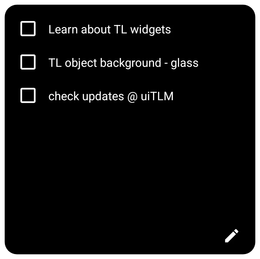 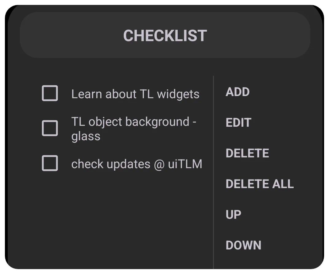 | This is a “To Do” list with each item preceded with an active checkbox for a user to indicate “completion” and an edit icon to enter the checklist dialog for creating, deleting, and managing the list. |
Key Functions and Customization
The Options dialog offers initial setup
- Items - This option offers the same item management as the widget container's “Edit” pencil icon. While it is possible to manage the items from this option dialog, the customary management will be done in the widget itself.
- Auto-delete - Check this to completely remove the item from the list if checked. If not checked and the item is selected and deleted, the item contents will remain but have a –strikeout through the contents–.
- Text color - This sets the color of all text content in the list items.
- Background - Defines the background of the widget container. See here.
- Margins: Allows adjustment of the margins surrounding the widget in its container. See here.
Functional Characteristics
The following describes the everyday use and management of the checklist widget:
- Edit Pencil Icon Item Management:
The item entry dialog offers the following options:
- Add - Tap to open the Checklist dialog and enter the item description. Then click “Cancel” or “OK”
- Edit - The user must tap the checklist item to select (highlight) it, then edit the item's contents. Then click “Cancel” or “OK”
- Delete - The user must tap the checklist item to select (highlight) it, then tap “Delete” to delete the item. The user is returned to the listing.
- Delete All - Tap this item to fully delete all items on the checklist. There is no confirmation request. Be cautious.
- Up - Select the list item to highlight it, then tap up to move the item one item up.
- Down - Select the list item to highlight it, then tap down to move the item one item down.
There is no stated limit on entries or on the character limit of an entry. The uiTLM wiki successfully tested 500-character entries and 10 entry items.
Widget: Application
The Application Widget serves as a container for third-party widgets provided by other apps installed on the user's device (e.g., Weather, Calendar, Music Player). Total Launcher extracts these standard Android views for placement by the user in the setup.
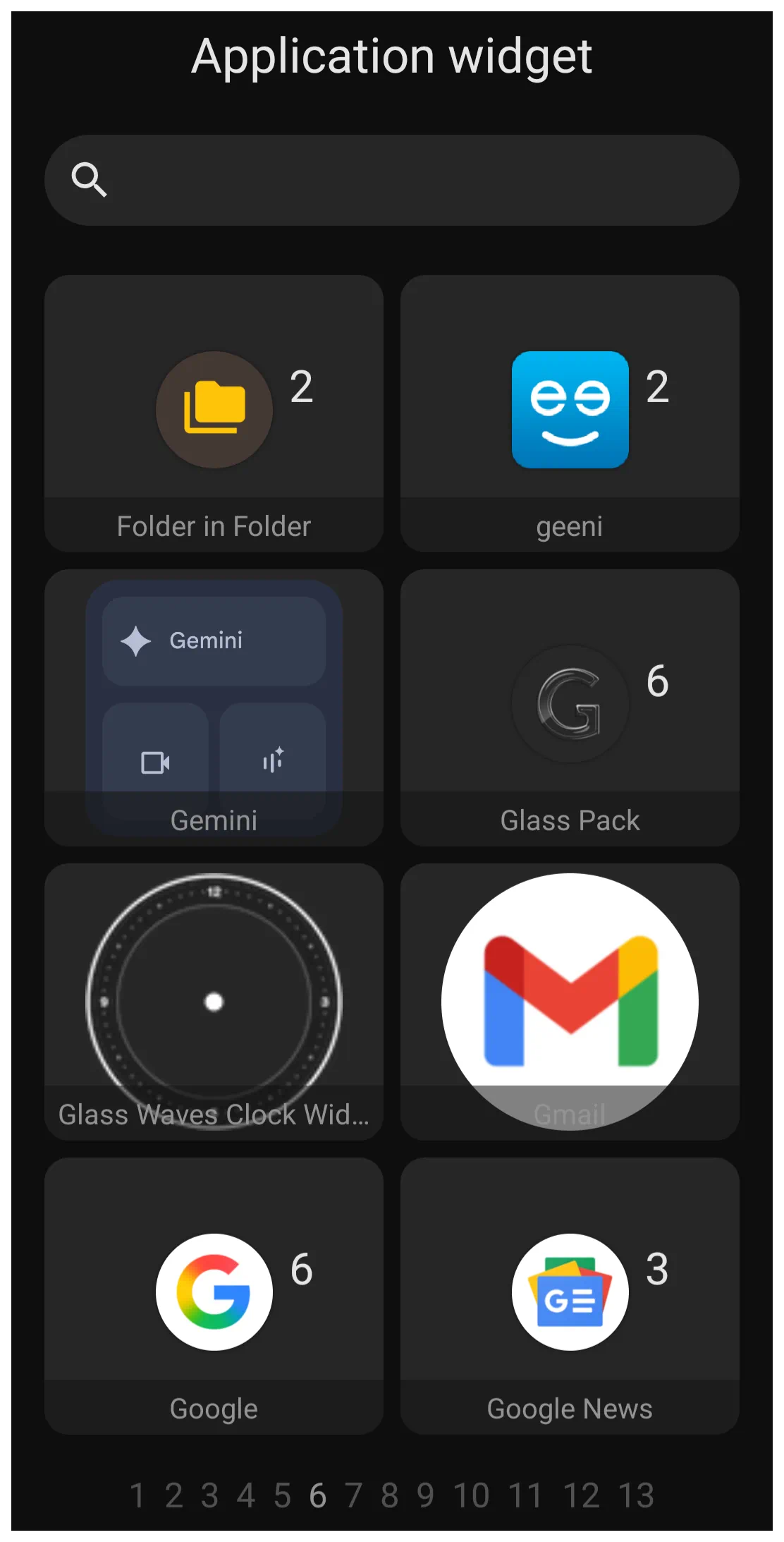 | The image shows Page 6 of 13 of the application widgets on the device used to capture the image. It is shown to provide the reader with sample view the application widget dialog. These application widgets may not be on any user's device. A user's device will only show a list of application widgets installed on their device. |
Android application developers will encode widget containers for specialized data display setups for their applications. When these are available with the application Total Launcher extracts and displays each in the application widget dialog for the user to select and install on a page, drawer, or window.
Each application widget developer provides customization opportunities for their respective widgets. However, Total Launcher, in managing an application widget, focuses on the visual presentation of the wrapper container. The dialog for the application widget Option Edit is shown below
 |
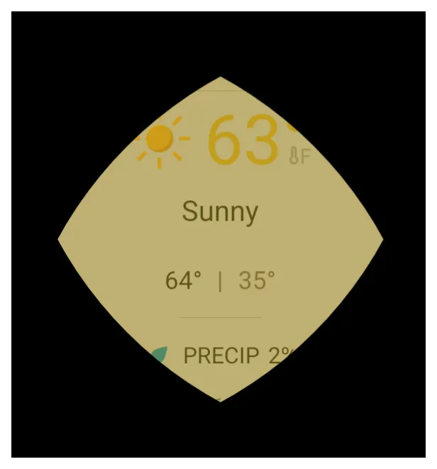
- Rounded corner radius - The widget's container defaults to a square but can be resized by tap-holding and grabbing a container corner. The user can choose to have corners rounded by selecting the desired radius, with a range of 0 (square), 300 (circle), to 575 (a rhombus-type, 4-vertex object with curvilinear sides, as shown in this image.
- Opacity - This allows the user to control how much transparency is applied when viewing the underlying content, in this case, the application widget. The launcher option provides a slider from 0 (opaque, with container content fully blocked) to 100 (fully transparent). This option will apply the effect to the entire widget container, meaning overall colors will be fully visible (100), muted (50), or the content blocked (0). Most likely, meaningful use of this option would be in combination with either the background option of color or dynamic color to provide a tonal quality to the widget container
 |
- Configure widget - This dialog appears for any Application Widget. However, it can only be activated by a user if the application developer has enabled the configuration feature. It will not work on every application widget, as shown with the notification in the image below.
 |
- Background - Defines the background of the widget container. For complete discussion on background see Background.
- Margins: Allows adjustment of the margins surrounding the widget in its container. For complete discussion on setting margins, see Understanding Margins in Total Launcher.
It is critical to remember that Total Launcher only saves the “Application Widget” placeholder on the page or window, not the 3rd-party widget's internal settings. When a backup is restored, the user will be responsible for returning to the application widget location, tapping its placeholder to initiate its reinstallation, and then reapply the application widget's settings.
Scaling vs. Resizing
There is a functional difference between resizing and scaling a widget in how they affect the widget's background size. Resizing the widget frame (dragging the corner handles) changes the container size, but the content inside does not automatically stretch to fill the new space. If the widget content appears too small or floats in empty space after resizing, use the rotate-transform icon  (then tap its
 Transform button and use the top slider [10-100]) to zoom the widget with its contents, which will not change the background size.
- Resize - Changes the boundaries of the container.
- Scale - Zooms the widget content and its container (background).
Many third-party widgets come with built-in, non-removable padding. Total Launcher's object negative margin may “crop” this outer space, which is useful for achieving perfectly rounded corners that hug the widget's actual content.
Interaction Handling
Application widgets retain their native functionality. If a widget contains a scrollable list (such as a generic RSS reader or Calendar), it will intercept touch events. Swiping directly on the widget will scroll the list content rather than swiping the launcher page.
Limitations of App Widget Backup & Restore
It is critical to remember that Total Launcher only saves the placeholder for Application Widgets, not the widget or its internal settings when a backup is made.
When restoring a backup, the specific configuration of the third-party widget (e.g., the specific city in a weather widget or the account in a mail widget) is not restored. The user must tap the placeholder to reinitialize the widget and manually reapply its internal settings unless the widget's developer has provided a save-setting or restore feature.
Widget Not Updating?
If a widget (such as a Clock or Battery monitor) lags or stops updating, the issue is usually with the Android System, not the launcher. Go to the device's Android Settings > Apps, locate the app that provides the widget, and ensure it is excluded from the device's “Battery Optimization” or “Deep Sleep” features.
Comments & Feedback
Toby Lancer is ready to help! Look for the Quick Help form:
► Desktop: left sidebar located near the bottom for Private to Admin
► Mobile: 3-bar menu at page top.
► Use the Discussion section below to share any experiences and communications with other Total Launcher users.
► Any Registered User can directly update this and any wiki page if desired.
Moderation: To keep the manual clean, all comments are held for appropriateness review. Preview any comment before submitting it. It will not be displayed after submission until it is reviewed. So, please, do not resubmit.
Formatting: If using any code snippets, place them inside code tags (e.g., 'code') using double single quotes (') before and after to keep them readable.
Be Kind: This is a community effort. Please keep feedback constructive and on topic.
~~DISCUSSION~~