meta data for this page
Shape Add - Rectangle
Dialog selections are discussed below the image. To navigate to an item, select it in the Shape Add - Rectangle image. If NOT selecting any item and wanting to return to the prior page: swipe right-to-left; use the browser’s ‘back’ arrow; or use the Wiki’s Backlink icon  on the right sidebar (mobile: drop-down dialog at the top of the page).
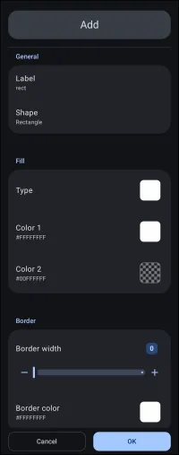
Shape Add - Rectangle dialog. Make selection above.
Elements that are clickable for navigation are:
- Label - the title/name of the shape to be created, which will be internally used by the Launcher in its previous screen dialog. This also becomes the shape's filename, which is not changeable. Every user has their own design scheme. Attempt to name these shapes to complement that scheme.
- Shape - 6 basic shapes are available. Selecting one will pre-fill the label field with its basic description if a label has not already been entered. If modifications to the basic shape's outline are available, an Options (gear) will appear next to its description.
- Rectangle - This shape is not modifiable at this stage but is at the page level Edit Mode
- Round rectangle - This shape is modifiable for its corner radius, individually or all 4.
- Oval - This shape is not modifiable at this stage.
- Arc - This shape is modifiable for its start and sweep angle.
- Squircle - This shape is modifiable for its curvature.
- Polygon - This shape is modifiable for its sides, radius, size, and rotation.
- Fill Type - Defaults to solid white (FFFFFFFF), shown as Color 1
- Fill Color 1 - The basic color of the shape
- Fill Color 2 - Defaults to transparent (00000000) and is the predominant color in any gradient pattern
- Border color - color of the edge of the object as an outline
- Cancel - void any input and return to the previous screen
- OK - activate any input and return to the previous screen
Other elements to note in the image are:
- Border width - The width of the object's notable edge can be adjusted using the dialog's slider or by entering a number directly in the button container. The default is 0, and the maximum is 288.
===== Hidden Index Anchors ===== ui-folder-options-shape-selection ui-resources-shape-selection-all-fill ui-resources-shape-selection-rect-color1-selection ui-resources-shape-selection-rect-color2-selection ui-resources-shape-selection-rect-border_color-selection ui-launcher_options-resources-shape
Comments & Feedback
Toby Lancer is ready to help! Look for the Quick Help form:
► Desktop: left sidebar located near the bottom for Private to Admin
► Mobile: 3-bar menu at page top.
► Use the Discussion section below to share any experiences and communications with other Total Launcher users.
► Any Registered User can directly update this and any wiki page if desired.
Moderation: To keep the manual clean, all comments are held for appropriateness review. Preview any comment before submitting it. It will not be displayed after submission until it is reviewed. So, please, do not resubmit.
Formatting: If using any code snippets, place them inside code tags (e.g., 'code') using double single quotes (') before and after to keep them readable.
Be Kind: This is a community effort. Please keep feedback constructive and on topic.
~~DISCUSSION~~