meta data for this page
- en
Note: The image below is a static preview and contains no clickable dialogs. To navigate away after reviewing:
- Go Back: Return to the Widget Select page or use the browser's back arrow (swipe right-to-left).
- Explore: Choose a new topic from the left sidebar menu.
Widget: App Drawer
 | The App Drawer widget is critical for advanced setup customization, offering flexibility in how apps are accessed. It can be placed directly on a page, within a window (to create a floating pop-up app drawer), or anchored to a screen edge (simulating a sliding drawer). |
Interaction & Navigation
The bottom Menu Bar 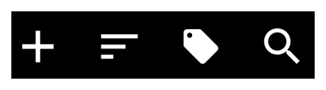 of the widget is the control center for finding and organizing apps. It contains the Add, Sort, Tag, and Search icons.
To customize the visual appearance of this bar (background, icon sets, text color/typeface), enter Edit On > select the App drawer (highlight) > select Object Design Menu (top)  >
> Options  .
.
Search
The Search icon  on the bottom menu bar offers two modes:
- Index Search - Offers a selection of initial letters, numbers, or special characters to jump to specific items.
- Keyboard Search - The 3-dot icon
 at the bottom opens a full keyboard search.
 - Folder Support - Search can optionally include items contained inside folders. Toggle this via
Main Menu>Launcher Options>Behavior>Search in folder.
Creating a Custom Search Window
To fully customize the search experience (position, background, font), create a Window containing an App Drawer widget. Set the window's Action on open to Launcher Action > App search or Contact search. This forces the keyboard to open immediately when the window launches.
See App & Contact - Search Customization for details.\
Sorting
The Menu Bar allows a managed Sort  icon on the menu bar.
- Temporary Sorting: Sort momentarily by Name, Recently installed, or Recent updates.
- Persistent Sorting: Defined in the widget's Shared Options \> Sort order. Options include:
- Name - Alphabetical.
- User Defined -Allows manual rearrangement of apps and folders in Edit Mode.
- Smart - Ranks items based on usage patterns (time of day, location, headset status, etc.). The number of “smart picks” can be set from 1 to 25.
- Tags
 - This allows users to group applications.
- Built-in Tags - Includes categories such as Productivity, Folder, and Hidden. Additional categories (Maps, News, Social, Games, etc.) can be enabled via
Main Menu\>Launcher Options\>Behavior\>Built-in tags. - Untagged Items - An option exists to display only items that have no tag assigned.
Visual Design
The design options are, again, available once the widget is selected and the Option icon is tapped.
Layout & Scrolling
- View Type - Toggle between Grid type (customizable columns/rows from 1 to 16) or List type (vertical list with icon and name).
- Scrolling - Behavior is vertical. Options include System scroll animation, Snap scroll (prevents items from being cut off), or Hide scrollbar.
Widgets placed in windows that have native scrolling will retain their own internal scrolling characteristics.
Item Aesthetics (Icons & Labels)
Users have detailed control over the visual presentation of apps. These can be applied globally via the Shared Options tab.
- Icon Customization
- Size & Padding - Adjust pixel size and margins (padding).
- Effects - Adjust Opacity, Saturation (0% = grayscale), or apply a Color Filter (overlay).
- Dragging - Individual icons within the widget can be dragged out and dropped onto a page layout.
- Label Customization
- Text - Toggle Show label on/off, select Typeface, and adjust Font size.
- Scaling - Scale X(%) controls the horizontal spread of the text.
- Shadows - Configurable Shadow color, Radius (depth), and Offset X/Y (direction).
Backgrounds & Menu Bar
- Widget Background - The overall background of the drawer.
- Menu Bar - Specific background for the bar as well as individual bar object icons, menu typeface and color.
Transparency Trick:
Users can set a color to Hex code #00000000 to make an element transparent (hidden) while keeping the item functional.
Animation & Badges
- Launch Animation - Located in the Edit dialog, this controls the effect when an app is opened. Options include
System default,No animation,Fast,Fade in,Popup, or directional slides (Flying to/Sliding from).
- Badge Counts - A visual indicator (red circle with a number) to show the number of unread notifications or new items waiting for the user within the specific app. These can be customized directly within the widget's Shared Options.
VERIFY THIS COMMENT: do badges show on App Drawer and not App Group? Check your phone … then adjust this … This is a difference from the App Group which displays badges, but customization is handled only system-wide via
Main Menu>Launcher Options>Icon Style>Badge Count.
Comments & Feedback
Toby Lancer is ready to help! Look for the Quick Help form:
► Desktop: left sidebar located near the bottom for Private to Admin
► Mobile: 3-bar menu at page top.
► Use the Discussion section below to share any experiences and communications with other Total Launcher users.
► Any Registered User can directly update this and any wiki page if desired.
Moderation: To keep the manual clean, all comments are held for appropriateness review. Preview any comment before submitting it. It will not display after submission until reviewed. So, please, do not resubmit.
Formatting: If using any code snippets place them inside code tags (e.g., 'code') using double single quotes (') before and after to keep them readable.
Be Kind: This is a community effort. Please keep feedback constructive and on topic.
~~DISCUSSION~~