meta data for this page
<!-- googleoff: index -->
⚠️ v4.0 UI Transition Notice - In Process: The release of Total Launcher v4.0 has introduced significant user interface changes. Please note that this page does not yet reflect these updates. The new layout paths, folds, and visual maps are currently being compiled and will be deployed shortly.
<!-- googleon: index -->
Note: The image below is a static preview and contains no clickable dialogs. To navigate away after reviewing:
- Go Back: Return to the Widget Select page or use the browser's back arrow (swipe right-to-left).
- Explore: Choose a new topic from the left sidebar menu.
Widget: Circle indicator
| Device resource | Data Value | Image |
|---|---|---|
| • Battery | % available | 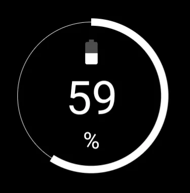 |
| • RAM usage | % available | 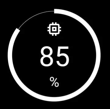 |
| • Storage (internal storage) | % available | 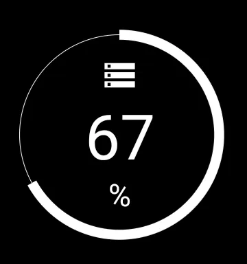 |
| • SD card | % available (if inserted) | 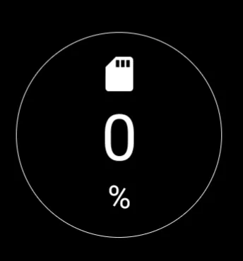 |
| The Circle indicator displays the current status of a specific device resource in a visual, circular format. | ||
Key Functions and Customization
The Circle indicator configuration allows users to select which system data is represented and how the indicator is displayed. The selection of which data value to present is made in the Target option of the dialog.
Customization options for the widget container and indicator appearance are:
- Color - Sets the color of the displayed graphic elements using either the launcher's Color Picker utility or Dynamic Colors. Learn about the dynamic color scheme here.
- Background - Defines the background selections (color, dynamic color, icon pack, shape, image, and dynamic image) for the widget container. See Background for more details if desired.
- Margins: Allows adjustment of the margins surrounding the widget in its container. See Understanding Margins in Total Launcher.
Comments & Feedback
Toby Lancer is ready to help! Look for the Quick Help form:
► Desktop: left sidebar located near the bottom for Private to Admin
► Mobile: 3-bar menu at page top.
► Use the Discussion section below to share any experiences and communications with other Total Launcher users.
► Any Registered User can directly update this and any wiki page if desired.
Moderation: To keep the manual clean, all comments are held for appropriateness review. Preview any comment before submitting it. It will not be displayed after submission until it is reviewed. So, please, do not resubmit.
Formatting: If using any code snippets, place them inside code tags (e.g., 'code') using double single quotes (') before and after to keep them readable.
Be Kind: This is a community effort. Please keep feedback constructive and on topic.
~~DISCUSSION~~