meta data for this page
Translations of this page:
- en
Note: The image below is a static preview and contains no clickable dialogs. To navigate away after reviewing:
- Go Back: Return to the Widget Select page or use the browser's back arrow (swipe right-to-left).
- Explore: Choose a new topic from the left sidebar menu.
Widget: Contacts
 | Contacts widget functions as a specialized container for displaying user contacts with extensive customization options for appearance, layout, and interaction as discussed below. |
General Functions and Filtering
The Contacts widget can operate in either a Grid type or List type format. Switching off the “Grid type” option makes it a list view.
- Content Display: By default, it can be set to display all contacts, or can be restricted to display only contacts with a phone number by turning off the Show even if no number option .
- Grouping: The widget allows for the use of contact groups based on the device service's tagging categories. This grouping can be turned on/off in the widget options.
- Layout: When using the Grid type, the user can customize the layout by setting the number of Columns and Rows. If grid is set to off, the display will list the contacts in a single column. See below for sorting options.
- Sorting/Interaction: The widget supports Family name first ordering, which is applicable to Western style names. If not selected it defaults to first name.
- Dialing: Direct calling by Long-click call to the contact's default number is available. This means a tap-hold on the contacts image/number is initiate the call if the user has previously granted permission to the system for the launcher to access the phone. Just a single tap will bring up the contact data page contained in the phone app.
Image and Photo Handling
The Contacts widget integrates photos associated with contacts through the system contact manager.
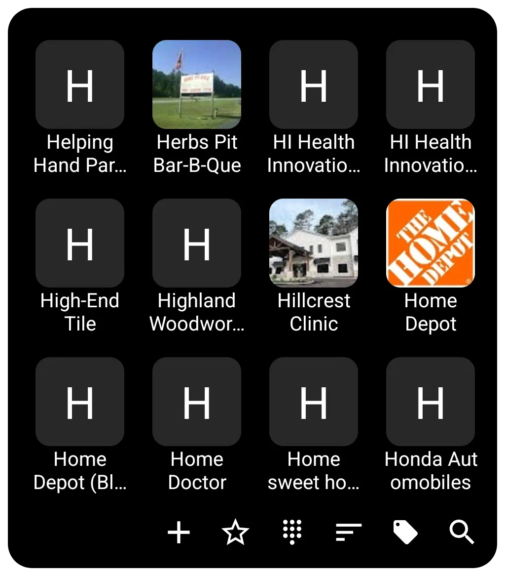
- Photo: The photo presented for each contact defaults to that contained in the contact app. If a contact item does not have a photo associated with it the contact image defaults to an icon with a single capital letter of contacts name based on sorting order. The user can set a Default photo within the widget's options for a user-selected icon, image, color, dynamic color, or shape to be used for all contacts lacking a contact app photo.
- Aesthetics: The size and spacing of the displayed contact icons/images are adjustable via icon size (in pixels) and icon padding (margins around the icon expressed as a percentage of icon size) and icon rounded corner.
Customization Details
Customization options for the Contacts widget are accessed via the options button (gear icon) while the widget is selected in Edit Mode.
- Layout and Scrolling
- The widget supports features for smooth navigation, including turning on system scroll animation.
- Snap scroll ensures that items are not cut off on the top or bottom when the scrolling motion settles.
- Quick scroll brings up a vertical alphabet the user can slide through to reach the contact area when the left or right widget edges are press and held. Quick action by the user is necessary else the scroll will advance fast automatically.
- The scrollbar on the right side can be hidden using the hide scrollbar option.
- Labels (Text)
- Labels can be hidden by turning off Show label.
- Customization includes selecting the typeface (font), adjusting the font size, and modifying the horizontal spread using scale X(%).
- Text color and shadow effects of shadow color, shadow radius (depth of the shadow), and shadow offset X/Y (the horizontal and vertical direction of the shadow) are fully configurable.
- Label lines setting determines the number of lines available for the label (1 to 3).
- Background
- Background setting will provide for complete color, dynamic color, icon pack, shape, image, or dynamic image selection.
- The background for individual items (item background), including states when pressed or focused (item background (pressed) and item background (focused)), can also be customized as covered in general background above.
- The distance between items is controlled by Item spacing (in pixels).
- See Background for more details if desired.
- Margins in this widge apply to the manageable space within the Contact container's 4 boundaries.
- See Understanding Margins in Total Launcher for a full explanation of how margins for simple objects (icon, text, image) may differ from container objects (folder, sliding drawer, widget, window) and how Total Launcher's “Item spacing” (aka “padding”) plays a part in visual appearance.
- Menu Bar
- The bottom menu bar used for controlling the widget contents is highly customizable in terms of color, dynamic color, icon pack, shape, and image. The appearance of text on the menu bar is adjustable via menu text color (can be invisible if desired) and menu text typeface.
- Menu bar elements include: (not discussed individually are add icon, star on icon, star off icon, dial icon, sort icon, group icon, search icon and clear menu icon
- Menu background is customizable in the same manner as Contact container background discussed above.
- Animation
- Enter animation for the Contacts widget actually occurs when the user completes a call and returns to the open Contact widget.
- See Page and Object Animation and UI Object Animation for an overview of animations available.
Comments & Feedback
Toby Lancer is ready to help! Look for the Quick Help form:
► Desktop: left sidebar located near the bottom for Private to Admin
► Mobile: 3-bar menu at page top.
► Use the Discussion section below to share any experiences and communications with other Total Launcher users.
► Any Registered User can directly update this and any wiki page if desired.
Moderation: To keep the manual clean, all comments are held for appropriateness review. Preview any comment before submitting it. It will not display after submission until reviewed. So, please, do not resubmit.
Formatting: If using any code snippets place them inside code tags (e.g., 'code') using double single quotes (') before and after to keep them readable.
Be Kind: This is a community effort. Please keep feedback constructive and on topic.
~~DISCUSSION~~