meta data for this page
Translations of this page:
- en
Note: The image below is a static preview and contains no clickable dialogs. To navigate away after reviewing:
- Go Back: Return to the Widget Select page or use the browser's back arrow (swipe right-to-left).
- Explore: Choose a new topic from the left sidebar menu.
Widget: Drawer handle
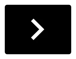 | This serves as an expanded trigger area to pull out a specific sliding drawer which is particularly useful if the default used by Total Launcher (a narrow invisible trigger area on the edge of the screen) is deemed too narrow or not accessible. Total Launcher supports four sliding drawers (left, right, top, and bottom). |
Customization and Configuration
The customization options for the drawer handle widget are specific to its function of linking to a sliding drawer and styling the trigger element.
- Target: This setting specifies A sliding drawer which this widget works for. The user will select the specific sliding drawer the handle will activate: • left • right • top • bottom
- Image: Select a substitute for the devault chevron (<∧>∨) in these launcher resources:
- Color filter: A color can be set to draw over the drawer handle. This uses the launcher's Color Picker described here.
- Background: Defines the background selections (color, dynamic color, icon pack, shape, image and dynamic image) for the widget container. See Background for more details if desired.
- Margins: Allows adjustment of the margins surrounding the widget container. See here.
Comments & Feedback
Toby Lancer is ready to help! Look for the Quick Help form:
► Desktop: left sidebar located near the bottom for Private to Admin
► Mobile: 3-bar menu at page top.
► Use the Discussion section below to share any experiences and communications with other Total Launcher users.
► Any Registered User can directly update this and any wiki page if desired.
Moderation: To keep the manual clean, all comments are held for appropriateness review. Preview any comment before submitting it. It will not display after submission until reviewed. So, please, do not resubmit.
Formatting: If using any code snippets place them inside code tags (e.g., 'code') using double single quotes (') before and after to keep them readable.
Be Kind: This is a community effort. Please keep feedback constructive and on topic.
~~DISCUSSION~~