meta data for this page
<!-- googleoff: index -->
⚠️ v4.0 UI Transition Notice - In Process: The release of Total Launcher v4.0 has introduced significant user interface changes. Please note that this page does not yet reflect these updates. The new layout paths, folds, and visual maps are currently being compiled and will be deployed shortly.
<!-- googleon: index -->
Note: The image below is a static preview and contains no clickable dialogs. To navigate away after reviewing:
- Go Back: Return to the Widget Select page or use the browser's back arrow (swipe right-to-left).
- Explore: Choose a new topic from the left sidebar menu.
Widget: Photo slide
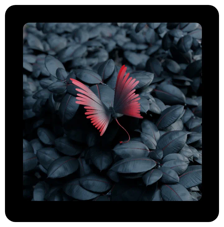 | A slideshow of sequential or random images from a designated folder, displayed at user-selected intervals. and customization options (such as grayscale or corner radius). |
Key Functions and Customization
uiTLM has successfully tested these types ot images support:
- .bmp
- .gif
- .ico
- .jpeg
- .jpg
- .png
- .9.png (nine patch)
- .webp
Customization features available in the widgets Edit dialog are:
- Photo folder - User-selectable folder on the device
- Change interval (sec) - Image will sequence within a user-selected range of 6 seconds to 60 seconds
- Skin - The skin is the actual viewing area of the container, making this option questionable. A best use is with a highly transparent color or shape with color to give the image a consistent or gradient hue. The Icon pack option could be used as a “logo,” but any insert will be centered and is not movable.
- Rounded corner radius - The widget's container defaults to a square but can be resized by tap-hold and grab. The user can choose to round corners by selecting a desired radius, ranging from 0 (square) to 300 (circle). Again, the diameter can be adjusted, even making an ellipse.
- Disable 3D animation - This option disables the default presentation of images in 3D animation consisting of randomly selected launcher animations such as cube, sliding (4 directions), flip, and more. Images will only change by sliding in four random directions.
- Keep photo centered - This keeps all images (some peripheral objects may not be shown), while the default shows images larger than the widget's container in a pan-type view randomly roaming the full image.
- Random pick - Presentation of images defaults to the directory's alpha-numerical order. Activating this option will cause random viewing.
- Grayscale - This option, if activated, displays each image as a gray-scaled image.
- Background - This offers the generic Background options of the launcher, which is of questionable use since the image itself occupies the full container. However, using Color in a transparent format (where
Aof ARGB is00) may provide an acceptable tint to the images shown. See here. - Margins: Allows adjustment of the margins surrounding the widget in its container. See here.
You could leave a comment if you were logged in.
Comments & Feedback
Toby Lancer is ready to help! Look for the Quick Help form:
► Desktop: left sidebar located near the bottom for Private to Admin
► Mobile: 3-bar menu at page top.
► Use the Discussion section below to share any experiences and communications with other Total Launcher users.
► Any Registered User can directly update this and any wiki page if desired.
Moderation: To keep the manual clean, all comments are held for appropriateness review. Preview any comment before submitting it. It will not be displayed after submission until it is reviewed. So, please, do not resubmit.
Formatting: If using any code snippets, place them inside code tags (e.g., 'code') using double single quotes (') before and after to keep them readable.
Be Kind: This is a community effort. Please keep feedback constructive and on topic.
~~DISCUSSION~~