meta data for this page
Translations of this page:
- en
Note: The image below is a static preview and contains no clickable dialogs. To navigate away after reviewing:
- Go Back: Return to the Widget Select page or use the browser's back arrow (swipe right-to-left).
- Explore: Choose a new topic from the left sidebar menu.
Widget: Slider
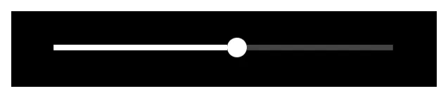 | Offering on-screen control of screen brightness and volumes (media, ring, notification, alarm, or call) through a linear representation with a “thumb” or bulb indicating the current point within the data range of the target. |
Key Functions and Customization
The default slider is basic. A horizontal line with a “thumb” or bulb which can be grabbed and slid for adjustment. All visual aspects of this object can be modified in the widget's edit dialog:
- Control - Select the specific target to control shown below. All target measures are visual adjustments along a predetermined length (which itself can be scaled) but there are no offered ranges.
- Screen brightness - The device's surface illumination
- Media volume - the music, videos, games and other multimedia applications
- Ring volume - if the device has phone capabilities, the volume of the ring
- Notification volume - the master control for all sounds used in notifications. If the user device has individual notification volume settings this will override that setting for immediate control.
- Alarm volume - Master control for any application which utilizes the “alarm” setting
- Call volume - if the device has phone capabilities, the speaker volume during a call.
- Thumb size - This is the bulb or solid circle (default) representing the current point with the range. Size range is 0 - 287.
- Thumb skin - This is the bulb or solid circle (default) which can be user-replaced
- Track thickness - The thickness of the line along which the thumb (bulb) will travel. Thickness range is 0 - 287.
- Track color - The visible color of the portion of the track to the right of the thumb position. Some may call this “unused capacity”. This is through Color or Dynamic Color.
- Progress color - The visible color of the portion of the track to the left of the thumb position, set via Color or Dynaic Color.
- Background - Defines the background selections (color, dynamic color, icon pack, shape, image and dynamic image) for the widget container. See Background for more details if desired.
- Margins: Allows adjustment of the margins surrounding the widget in its container. See here for a better understanding.
Comments & Feedback
Toby Lancer is ready to help! Look for the Quick Help form:
► Desktop: left sidebar located near the bottom for Private to Admin
► Mobile: 3-bar menu at page top.
► Use the Discussion section below to share any experiences and communications with other Total Launcher users.
► Any Registered User can directly update this and any wiki page if desired.
Moderation: To keep the manual clean, all comments are held for appropriateness review. Preview any comment before submitting it. It will not display after submission until reviewed. So, please, do not resubmit.
Formatting: If using any code snippets place them inside code tags (e.g., 'code') using double single quotes (') before and after to keep them readable.
Be Kind: This is a community effort. Please keep feedback constructive and on topic.
~~DISCUSSION~~