meta data for this page
- en
This is an old revision of the document!
⚠️ v4.0 UI Transition Notice - In Process: The release of Total Launcher v4.0 has introduced significant user interface changes. Please note that this page does not yet reflect these updates. The new layout paths, folds, and visual maps are currently being compiled and will be deployed shortly.
Phase 1: The Object (Visual Mastery)
In Total Launcher, everything — an app icon, a text label, a background shape, or a widget — is an “Object”. Learning how to style one object yields knowing how to style them all.
This phase covers the visual attributes: Appearance, Geometry, and Effects.
Accessing the Designer
Before you can change how an object looks, you must enter the design menu.
- Method 1 (Direct): Long-press (tap and hold) to highlight the object and open the Object Design menu at the top of the screen.
- *Action:* Select
Editicon (pencil) in the center of the page to quickly resize or move the object or
 - *Action:* Select the
Optionsicon (gear) in the Object Design menu to open the full attribute list.
- Method 2 (The
Edit ModeToggle): If long-press is disabled (common in finished themes), pinch-in on the screen to open the main menu and toggleEdit Modewhich displays a current state ofEdit off in the lower right corner. Tap it to turn it “On”
  .
.


The "Geometry" (Size & Position)
New users often confuse “Scale” with “Size.” It is critical to distinguish them.
- The Bounding Box (Size): This is the physical clickable area of the object.
Geometry & Alignment
- The Bounding Box (Clickable Area):
- How to change: Long-press the object to select it, then drag the blue handles or tap the
Editicon (pencil) and input specific W (Width) and H (Height) pixel values. - Visual Sizing (Content):
- For Text: Use Scale X (%) in the Text Options to stretch or compress the font width.
- For Icons: Use Icon Padding in the Icon Options. Increasing padding makes the icon appear smaller without shrinking the clickable bounding box.
Rotation vs. Transformation
- Rotation or Transformation

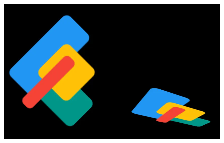
- Rotation: Spins the object on a 2D plane (like a clock hand). Range is -180° to +180°.
- Transformation: Tilts the object in 3D space (X and Y axes).
- *Note:* Rotation must be activated before Transformation options become available.

Icon: Rotated @ 45
vs
then Transformed @ Y-axis 50
Typography & Text
Text objects can be static (labels) or dynamic (data).
The Two Types of Text
- Static Text: Plain labels like “Home” or “Apps.”
- Dynamic Text: Total Launcher can display system data. When adding text, you can choose standard formats like Date (e.g., M/d/yyyy) or Time (e.g., hh:mm), or use Text Tags for battery, RAM, or unread counts. See the dialog


Text Formatting Options
Found under the selected (highlighted) object's Options > Text as shown in the dialog


- Typeface: Choose from system fonts or user-imported TTF files.
- Capitalize: Forces all text to UPPERCASE automatically.
- Scale X (%): Stretches the text width. <100% creates “condensed” font; >100% creates “wide” font.
- Label Lines: Limits text to 1, 2, or 3 lines (useful for preventing long app names from overlapping other icons).
Icons & Images
Use more than the default app icons.
- Icon Packs: Apply a global icon pack to all icons in Launcher Options, or override a single object by selecting
Options>Icon>Icon Pack. - Color Filters: A powerful tool to silhouette an icon.
- *How it works:* Apply a solid color (e.g., White) over a colorful icon. This flattens it into a minimal shape.
- Settings: Set White color to 50% transparent (slider) and Saturation to 0% to make it grayscale (Black & White) or to 100% for full color.
Icon: Native
vs
White @ 50%; Saturation @ 0%

Backgrounds & Shapes
Every object sits on a “canvas” called the Background.
The Gradient Trick
- Solid Color: Select a single color in the option
colorof the launcher's Color Picker (supports transparency/alpha). - Shapes: Choose Rectangle, Oval, Rounded Rectangle, Arc, Squircle, or Polygon.
- *Gradient Tip:* In the Shape menu, there is Color 1 and Color 2. Set them to different colors to create a gradient, or set Color 2 to “Transparent”
100%to get a fade-out effect. Then selectFillto pick the desired effect.
| Color Picker: Round Rectangle Color1 Red Color2 Green | Shape: Fill dialog Color1 Red Color2 Green | Color Picker: Rount Rectangle Color1 Red Color2 Transparent | Shape: Fill dialog Color1 Red Color2 Transparent |
|
|---|---|---|---|---|
 |  |  |  |
Shadows & Depth
Shadows are applied to the content (the text letters or icon shape), not the bounding box.
- Radius: Controls the blur. A high radius (e.g., 20px) looks like a soft glow; a low radius (1px) looks like a hard outline.
- Offset X/Y: Controls the light source direction.
- *Pro Tip:* Set Offset X and Y to 0 and use a bright shadow color to create a “Neon Glow” effect around text.
Shadow & Depth
Plain
Offset X 5 Offset Y 5 Radius 20
Offsets 0 Radius 1

Comments & Feedback
Toby Lancer is ready to help! Look for the Quick Help form:
► Desktop: left sidebar located near the bottom for Private to Admin
► Mobile: 3-bar menu at page top.
► Use the Discussion section below to share any experiences and communications with other Total Launcher users.
► Any Registered User can directly update this and any wiki page if desired.
Moderation: To keep the manual clean, all comments are held for appropriateness review. Preview any comment before submitting it. It will not be displayed after submission until it is reviewed. So, please, do not resubmit.
Formatting: If using any code snippets, place them inside code tags (e.g., 'code') using double single quotes (') before and after to keep them readable.
Be Kind: This is a community effort. Please keep feedback constructive and on topic.
~~DISCUSSION~~