meta data for this page
Translations of this page:
- en
This is an old revision of the document!
robots=noindex,nofollow
Total Launcher v4.0 Update Review
An important update has arrived for Total Launcher, marking the platform's transition to version 4. This update provides an overhauled interface, along with brand-new menu and layout structures, shapes, and graphical properties.
For official developer insights, refer to the Official Total Launcher v4 Blog Post. A detailed breakdown of these new features and options is outlined.
Overhauled User Interface and Search Navigation
- Internal UI Redesign: Provides a cleaner look across launcher options and layout setup screens, matching modern Android design aesthetics.
| Version 3 UI | Version 4 UI |
|---|---|
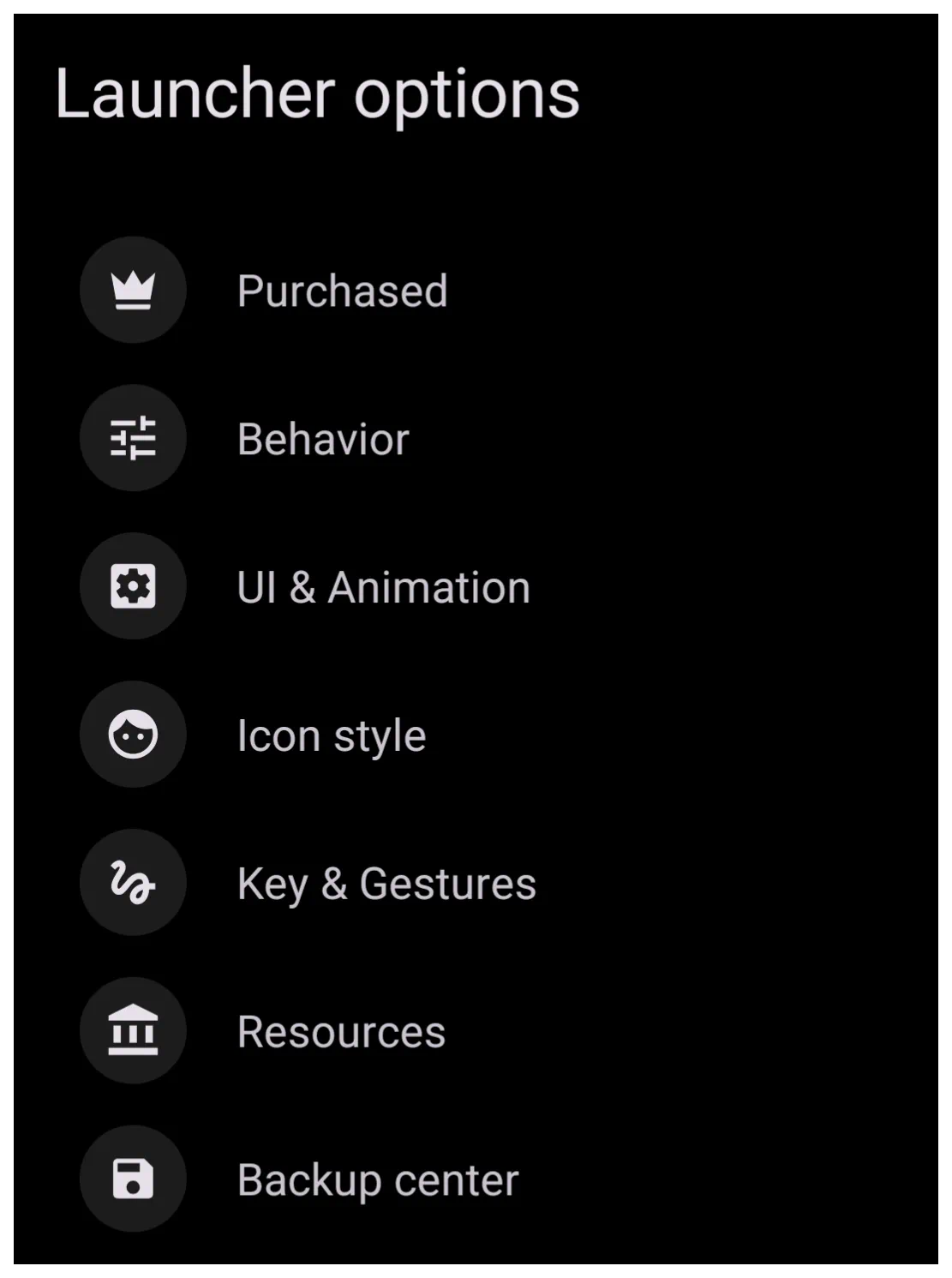 | 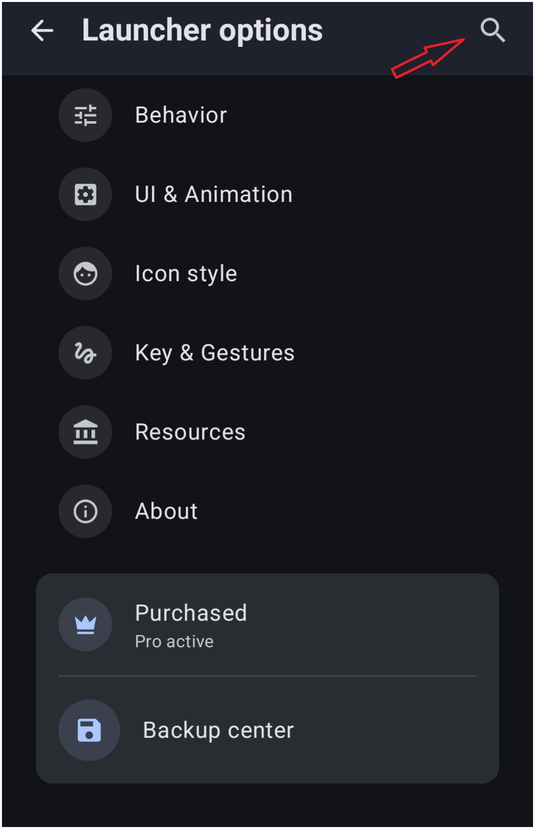 |
- Launcher Options Search Bar: Implements a direct text filter bar at the top of the primary Launcher options menu to assist with Launcher settings (see above).
- Avoids manual digging through multi-nested menus.
- Inputting an entry jumps directly to the intended configuration setting.
Creative Layout Configurations and Geometric Shapes
New layout and advanced shape customizations
| Fidget Spinner Circle Layout: | Image |
|---|---|
• Introduces a dynamic Fidget spinner mechanic to the standard Circle layout. This can be assigned to rotate the layout objects for active interactions. |  |
| Squircle Shape | Image |
|---|---|
| • Adds a native Squircle option into object shape selectors, bridging the gap between oval, rectangle, and rounded rectangle selections. • A true Squircle will have rounded sides (to a degree). The curvature option ranges from 2 to 10, tending toward a rounded rectangle. | 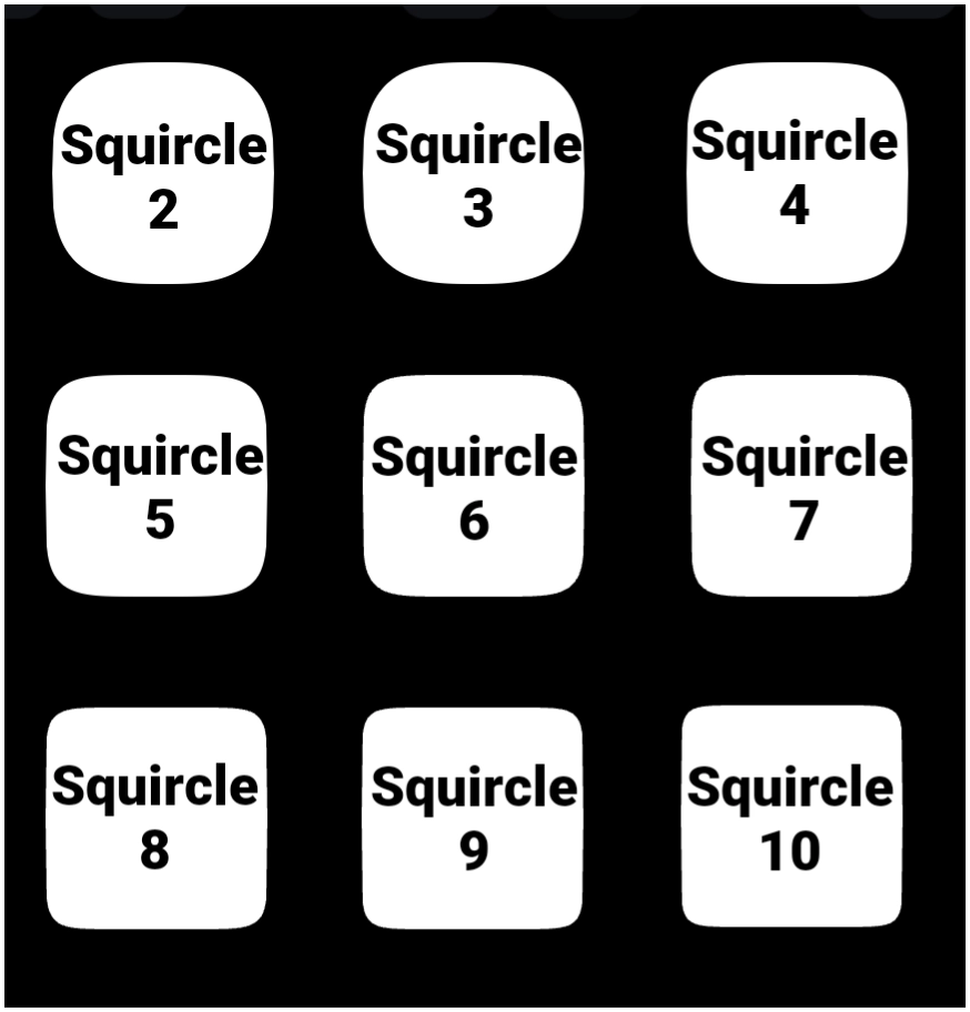 |
| Polygon Shape | Image |
|---|---|
| • Introduces custom multi-sided Polygon geometry for tailored masking or background plates. • As polygon sides increase, the shape trends to an oval. | 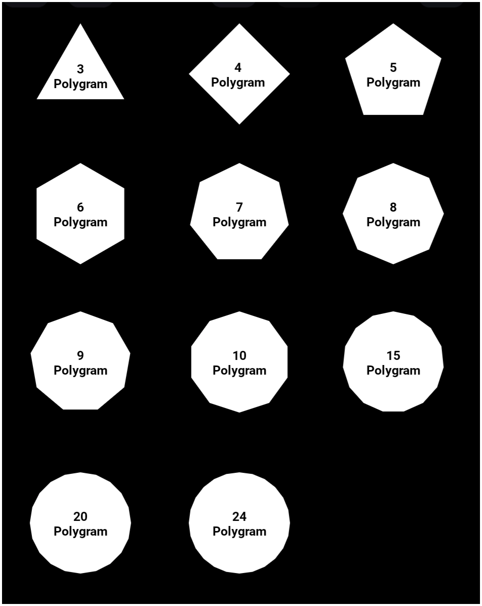 |
| Round Rectange Distinct Corner Control | Image |
|---|---|
| • Upgrades the Round Rectangle object mechanics with individual control parameters provided for each of the four distinct corners, allowing asymmetric designs by assigning independent corner radius pixel values. • The 'curvature' ranges from 0 to 285. • In this example, the corners (starting in upper left) are: (1) 16, 28, 36, 44 (2) 28, 56, 112, 224 (3) 0, 285, 0, 285 | 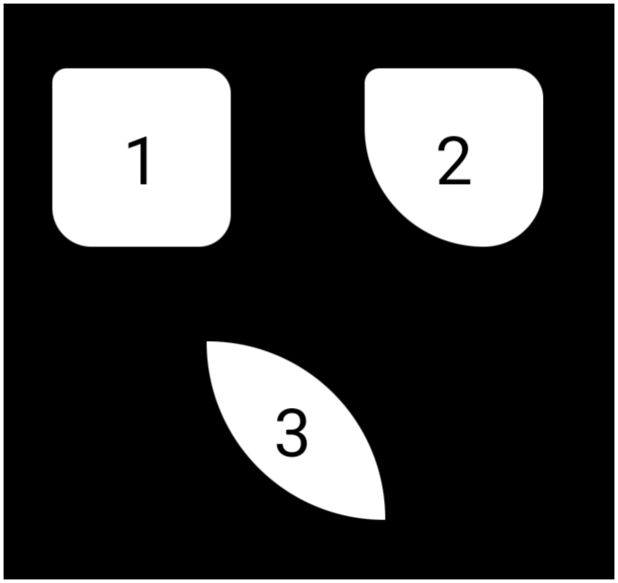 |
Enhanced Graphic Objects and System-Level Customization
Advanced options regarding graphic text masking and object backgrounds
| Bitmap Shader for Text: | Image |
|---|---|
| • Text graphic components now support a “Bitmap shader” property instead of a solid color. • Select the text color, then pick color, dynamic color, shape, or image as the external texture map for text characters. | 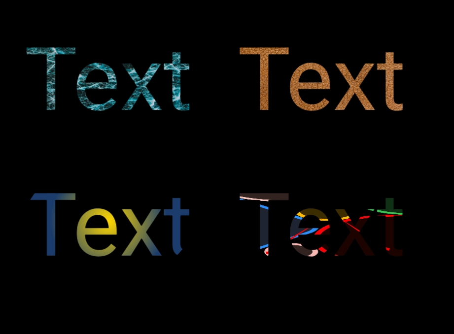 |
| System Bar Background Fills: | Image |
|---|---|
| • Status bars and navigation bars can now be styled with specialized images and custom shape structures. • This eliminates reliance on basic native system tinting and fully integrates the device status and navigation zones into the overall theme background. • The setting is found in Launcher options > UI & Animations. To visualize this, do not activate the Hide feature for the status bar or the navigation bar.• The image to the right is a very basic example of the top status bar and the bottom navigation bar using a gradient shape. | 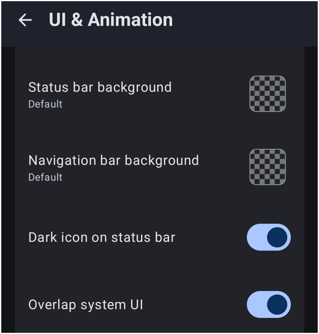 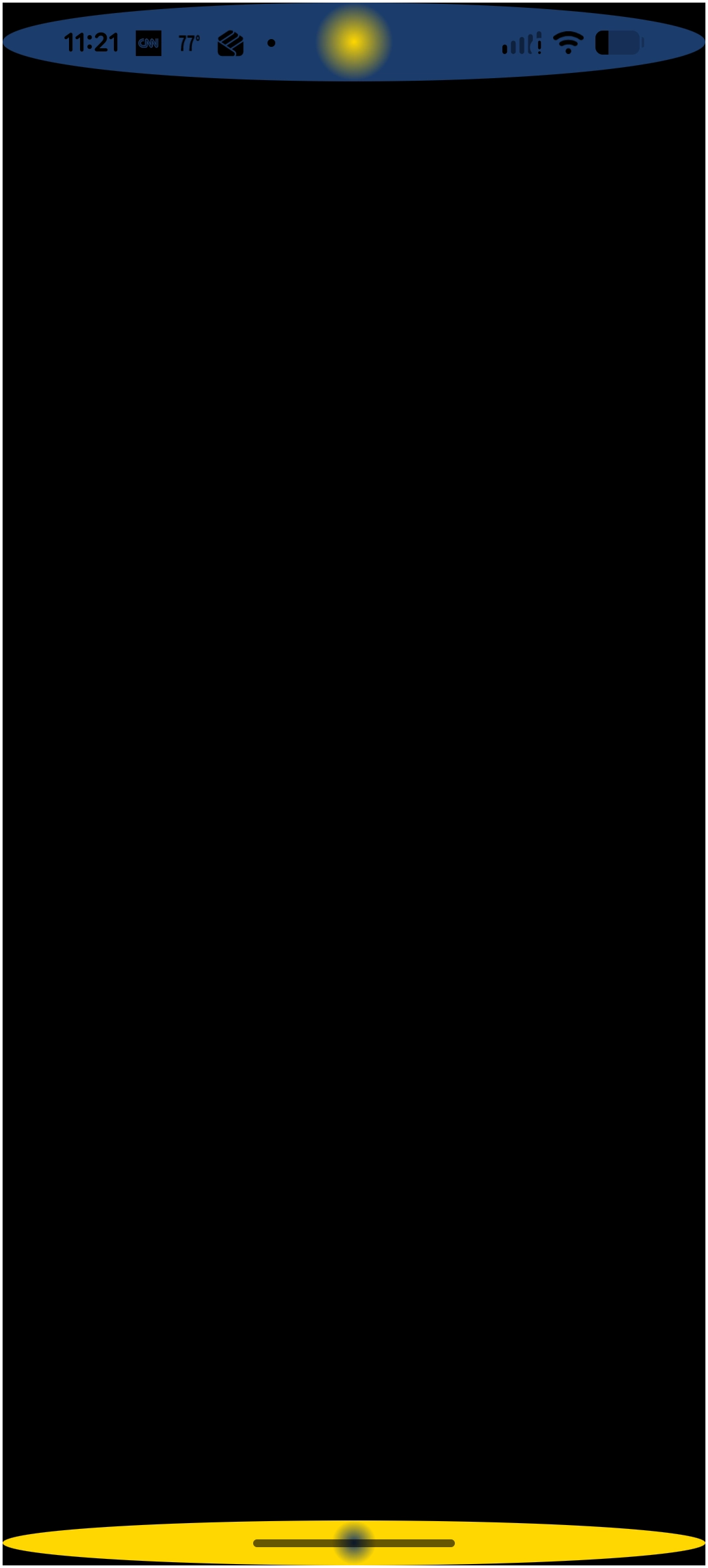 |
Discussion