meta data for this page
- en
This is an old revision of the document!
Total Launcher Layout Objects
Custom layouts are fundamental building blocks within the Total Launcher ecosystem, providing the primary mechanism for organizing clickable graphic objects, shortcuts, and widgets. Unlike simple free-form object placement, applying a specialized Layout Object automatically imposes a set of alignment and spacing rules on the content it contains. This guide explains the shared design fundamentals applicable to all layout types, followed by specific guides for unique list (linear), circle (radial), and grid (matrix) configurations.
Understanding Layout Properties
While Total Launcher offers distinct spatial arrangement types (Grid, Circle, List), the visual styling options and interaction rules for the items contained inside these layouts remain completely uniform. The configuration interface features four standardized tabs present in every layout dialog. These global functions must be understood first, as they constitute the standardized visual design system across all layout implementations.
Shared Style Tabs
Each layout configuration dialog includes the following four tabs for uniform object styling:
- Icon: Controls visual attributes of contained image graphics. Note that this often adjusts the internal space surrounding the icons (Icon padding), global visibility (opacity and saturation), and applies color overlays uniformly to create cohesive themes.
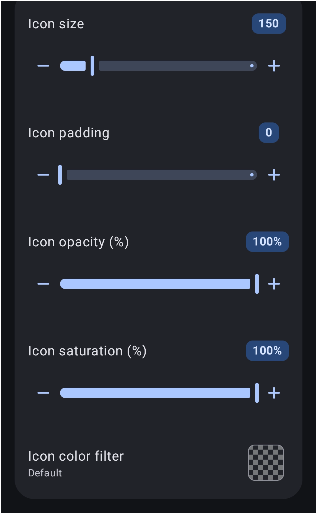
Options - Icon
Modify the visual attributes of the icon images contained within the grid.
- Icon size: - Adjust the overall size (scale) of the icons.
- Icon padding: - Modify the internal space surrounding the icons.
- Icon opacity (%): - Adjust the transparency level of the icons, utilizing values such as
100%for solid visibility. - Icon saturation (%): - Modify the color intensity, where
100%represents natural colors and reduced values approach grayscale. - Icon color filter: - Apply a specific color overlay or tint to all icons uniformly.
- Label: Dictates the typography for text descriptions associated with contained items. This encompasses typeface selection, vertical wrapping (Label lines), sizing, scaling, and the transition of color when an object is pressed or interacted with.
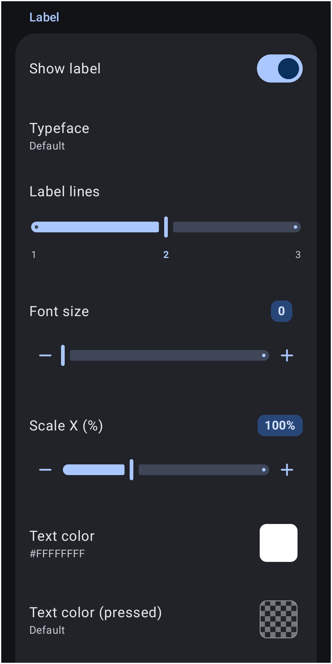
Options - Label
Control the display parameters and typography of the text associated with each grid item.
- Show label: - Toggle the visibility state of the text labels to On or Off.
- Typeface: - Select the specific font family applied to the label text.
- Label lines: - Determine the maximum number of lines permitted for text wrapping, ranging from
1to3. - Font size: - Adjust the structural point size of the label text.
- Scale X (%): - Stretch or compress the text width horizontally.
- Text color: - Define the primary resting color of the text using the Launcher's Color Picker and apply a hexadecimal value such as
#FFFFFFFF.] - Text color (pressed): - Same as
Text colorabove, but changes the text color as the object is 'pressed' or tapped.
- Shadow: Provides dedicated drop shadow controls specifically for item labels. Detailed specifications regarding how to utilize Shadows can be referenced here.
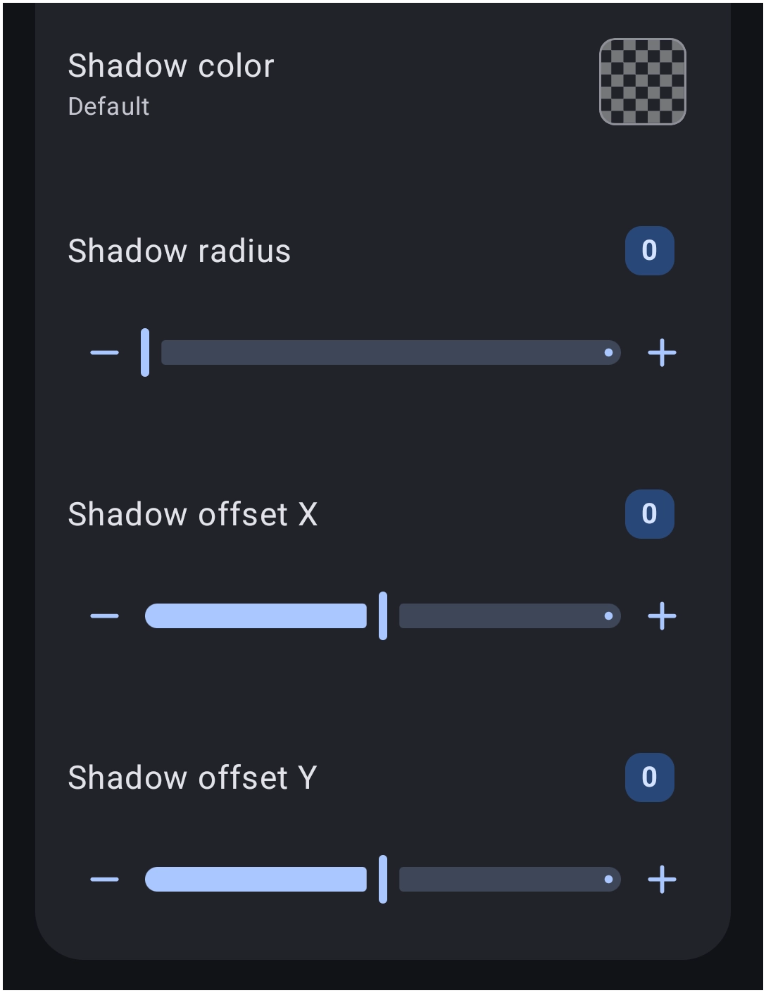
Options - Shadow
Apply drop shadows to text labels for enhanced contrast against varied backgrounds. See here for more detail on how to use Shadows.
- Shadow color: - Select the hue of the underlying text shadow.
- Shadow radius: - Control the blur, spread, or sharpness of the shadow effect.
- Shadow offset X: - Shift the shadow position along the horizontal axis.
- Shadow offset Y: - Shift the shadow position along the vertical axis.
- Background: Configures the styling of the overall layout container and the individual background states (resting, pressed, focused) for items contained within. Standard margins and item spacing properties are also defined within this section.
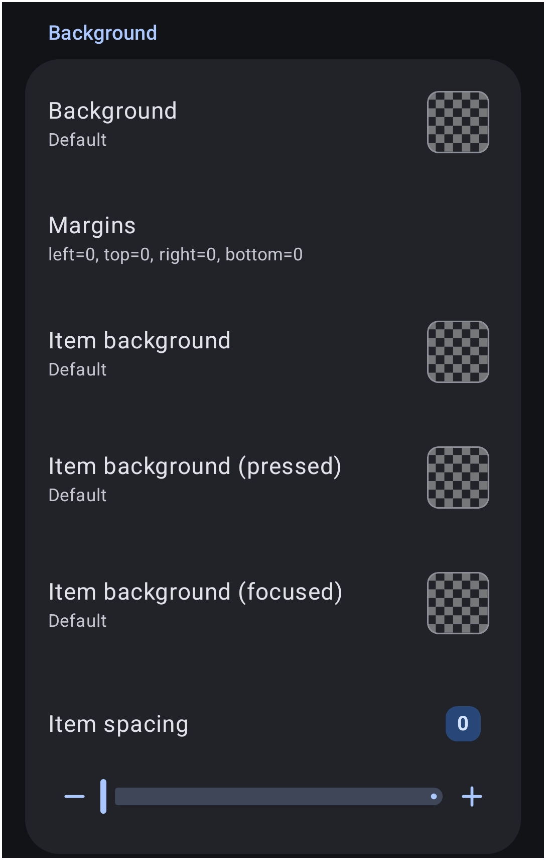
Options - Background
Configure the container styling, individual item backgrounds, and spacing options.
- Background: - Set the global color or image for the entire grid container.
- Margins: - Define the external spacing outside the grid boundary, requiring specific integer values for
left,top,right, andbottom. - Item background: - Set the resting background color or image for individual grid items.
- Item background (pressed): - Set the background visual for individual grid items during a press interaction.
- Item background (focused): - Set the background visual for individual grid items when navigated to via hardware controls or focus states.
- Item spacing: - Adjust the internal gap distance between individual items placed within the grid structure.
This standardization ensures that design preferences, such as specific font sizes or background colors, are preserved regardless of the chosen spatial arrangement. Future visual theme adjustments only require editing the global configuration rules defined in these tabs.
The Specific Layout Types
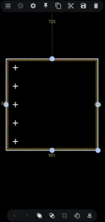
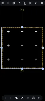
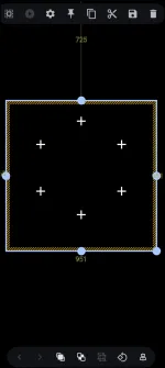
To create custom Android interfaces, one of three specialized structural archetypes must be selected. Although they share the visual configuration system detailed above, each utilizes a distinct method of spatial organization. The subsequent documentation details the distinct properties unique to each layout style.
Select a layout type to review its dedicated unique options:
Discussion