meta data for this page
Launcher Actions
Dialog selections are discussed below the image. To navigate to an item, select it in the Launcher Actions image. If NOT selecting any item and wanting to return to the prior page: swipe right-to-left; use the browser’s ‘back’ arrow; or use the Wiki’s Backlink icon  on the right sidebar (mobile: drop-down dialog at the top of the page).

Launcher Actions dialog. Make selection above.
Do nothing
- No Launcher action will be assigned to the object. Assignment of other object actions (Window, Sequence, Folder, Application) or options (color, image, icon pack, shape) can be made later.
Expand notifications
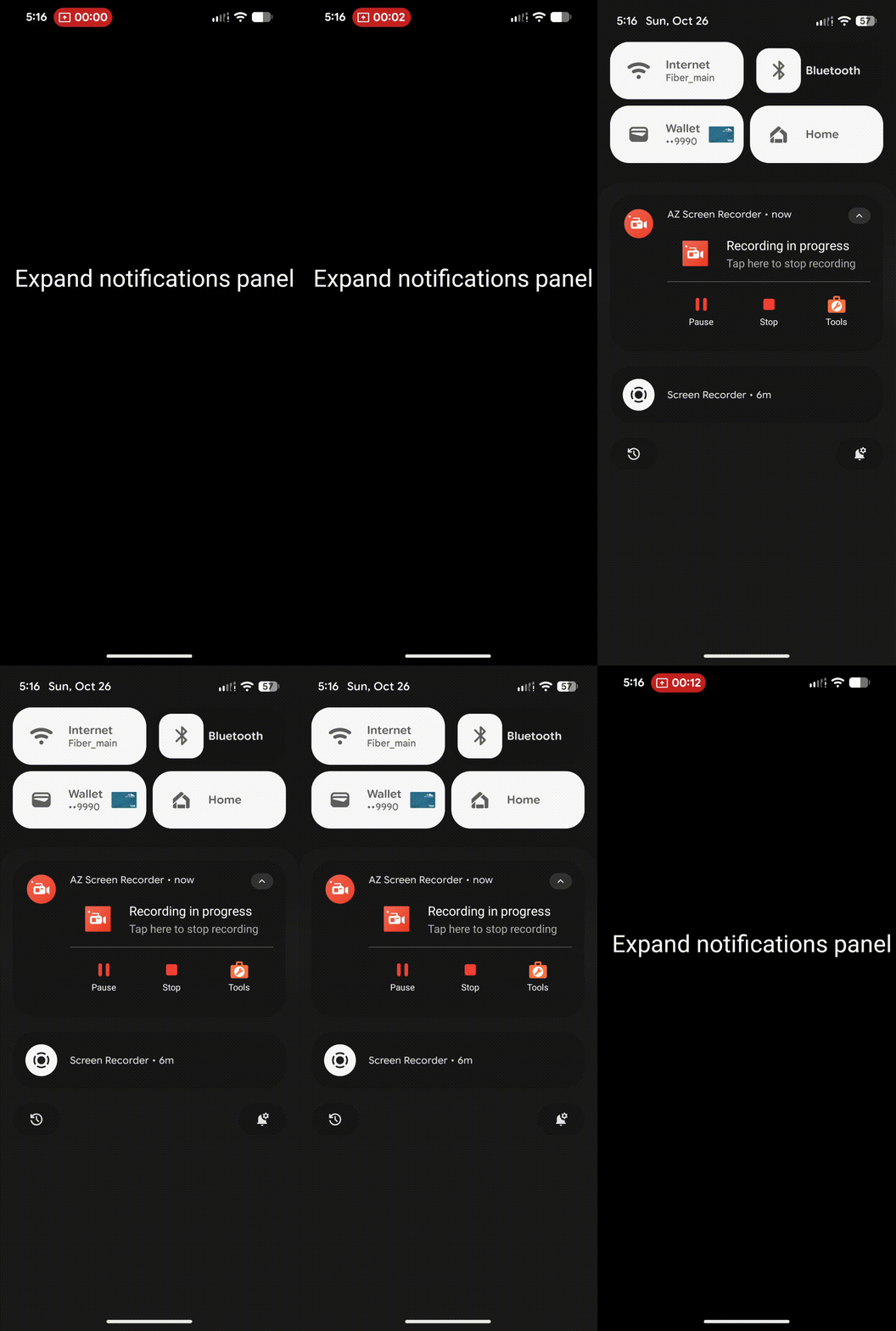
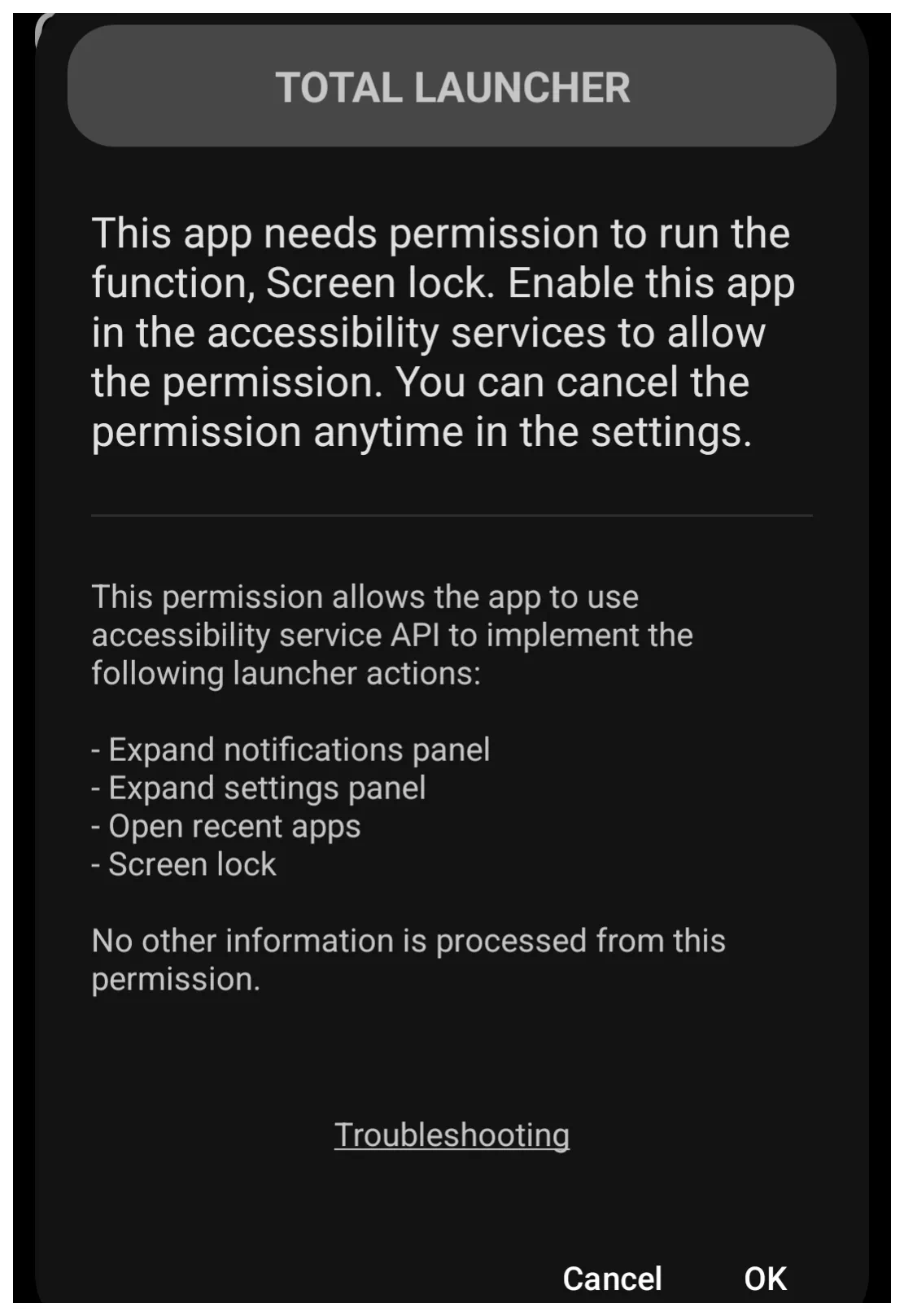
- This is the Notification Shade that drops down when swiping down from the top of the screen. See the demo of this action: Expand notification panel. The user may also see this Total Launcher initial permission notification with this dialog.
Expand quick settings
- Also known as Quick Set Tiles that have been set to show but can be expanded to edit, re-order/show all such tiles. See the demo of this action: Expand quick settings. The user may also see this Total Launcher initial permission notification with this dialog.
Toggle edit mode
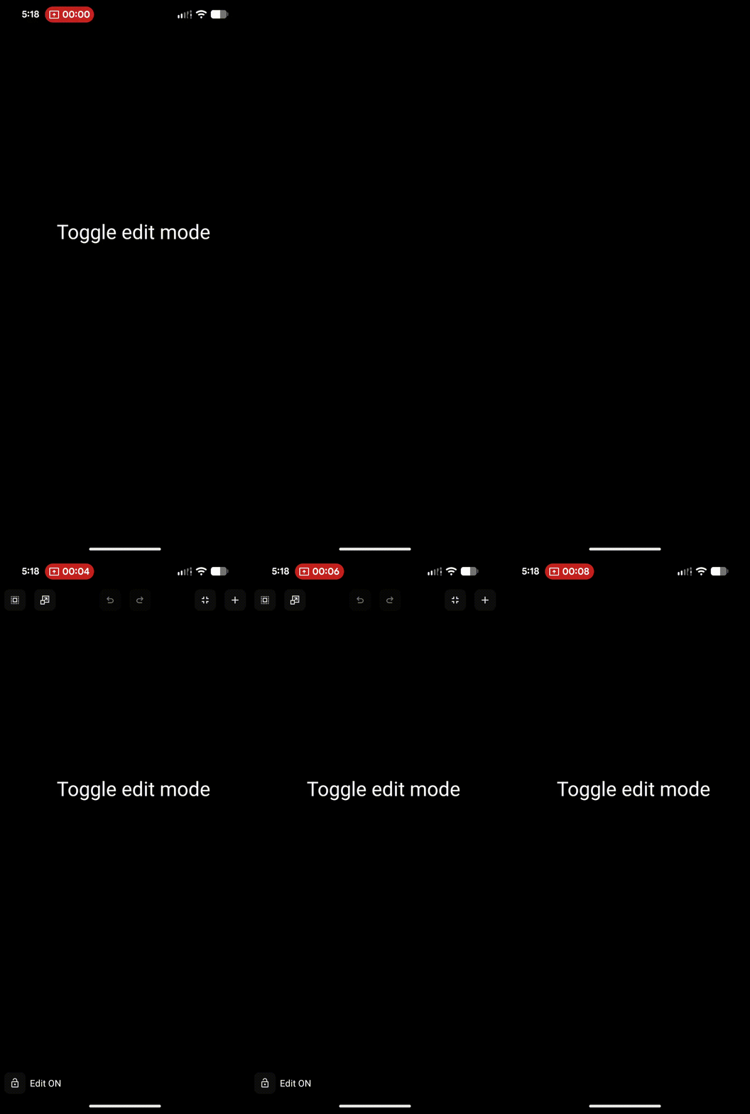
- Tap to be placed in Edit On mode instantly (if the user has not required a password). See the demo of this action: Toggle edit mode.
Open menu
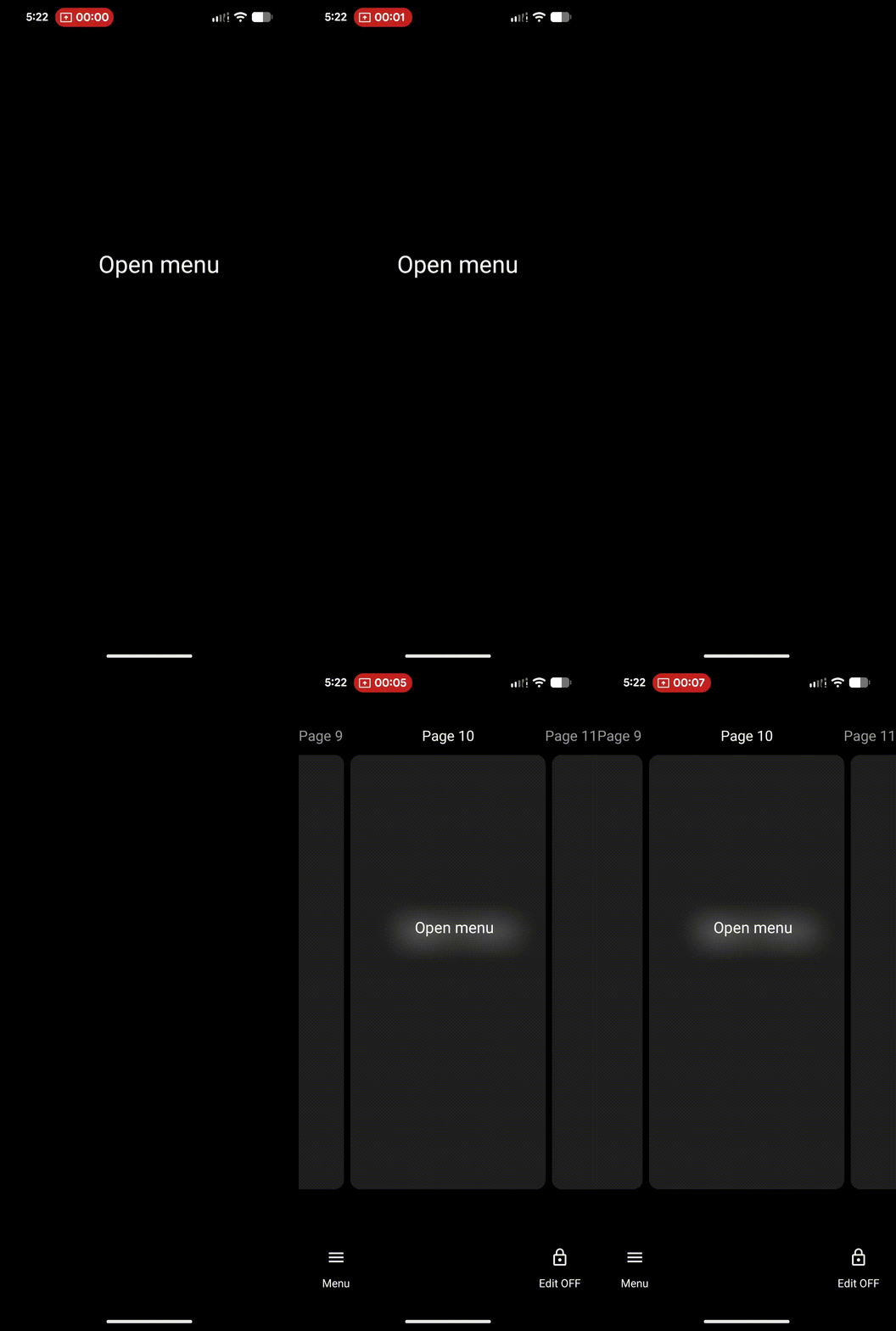
- Tap to access the Main Menu (Edit mode is off). Password still required if set. See the demo of this action: Open menu.
Open Launcher options
- Tap to access the Main Menu's Launcher options (Behavior, UI & Animation, Icon style, Keys & Gestures, Resources, and Backup center). Password is still required if set. See the demo of this action: Open Launcher options.
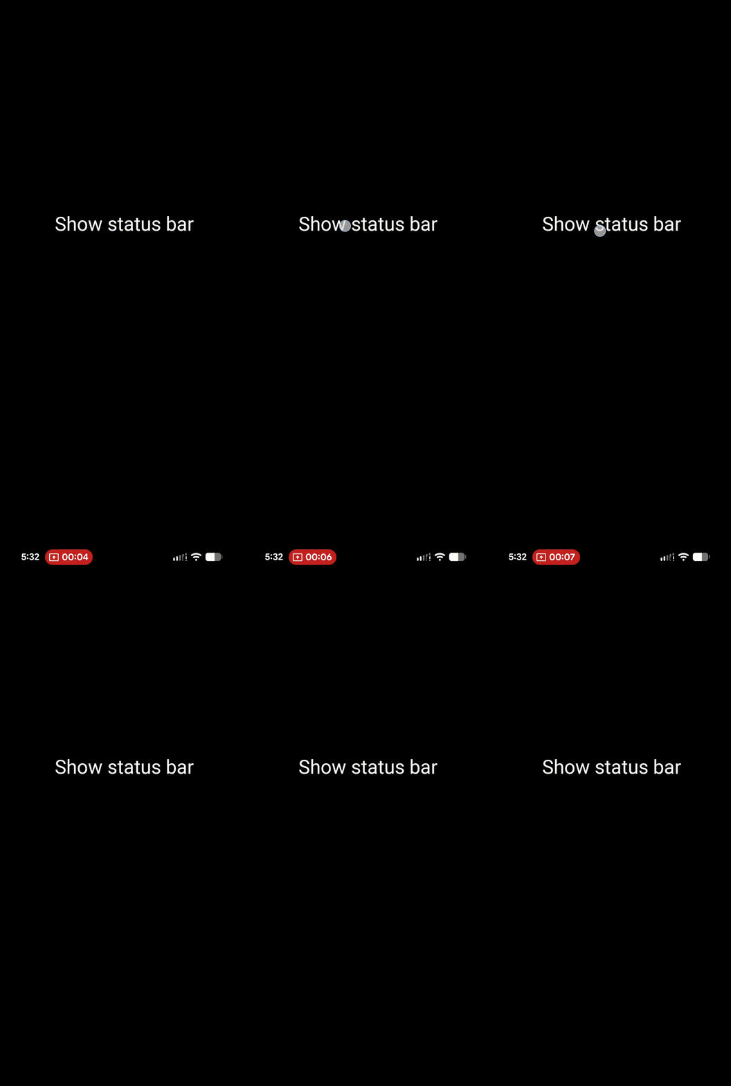
Show status bar
- This is a one-way setting (vs. a toggle) to either show the system's status bar located at the top of the screen, which shows time, notification icons, wifi strength, data strength, and battery status. The Launcher's UI & Animation section has a setting to hide the status bar, so this Launcher action lets you temporarily view it with any activity (screen touch, page change, etc.), then reverts to hidden status (if set). See the demo of this action: Show status bar.
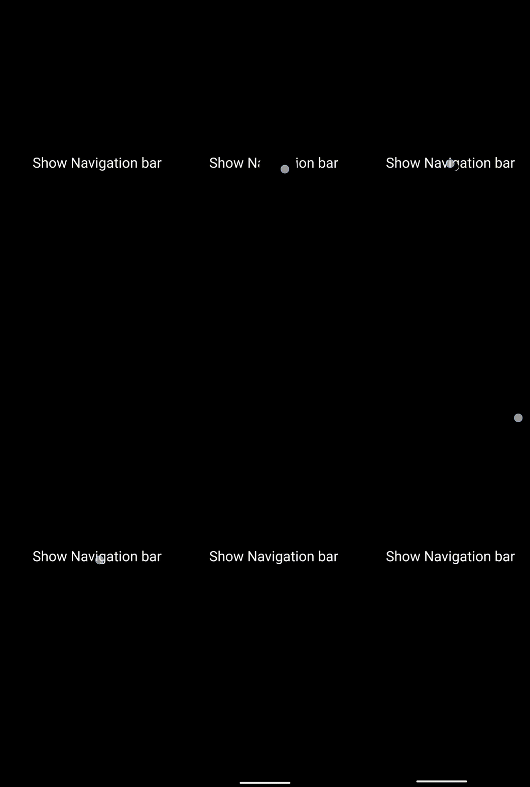
Show navigation bar
- Some Android versions and devices have a setting for the bottom of the screen to contain buttons for navigating the device (Back, Home, and Recent apps). If so, and the user prefers not to have that showing at all times, the Launcher UI & Animation section has a setting to hide the navigation bar. This Launcher action allows temporary viewing and use, then reverts to hidden status if set. See the demo of this action: Show navigation bar.
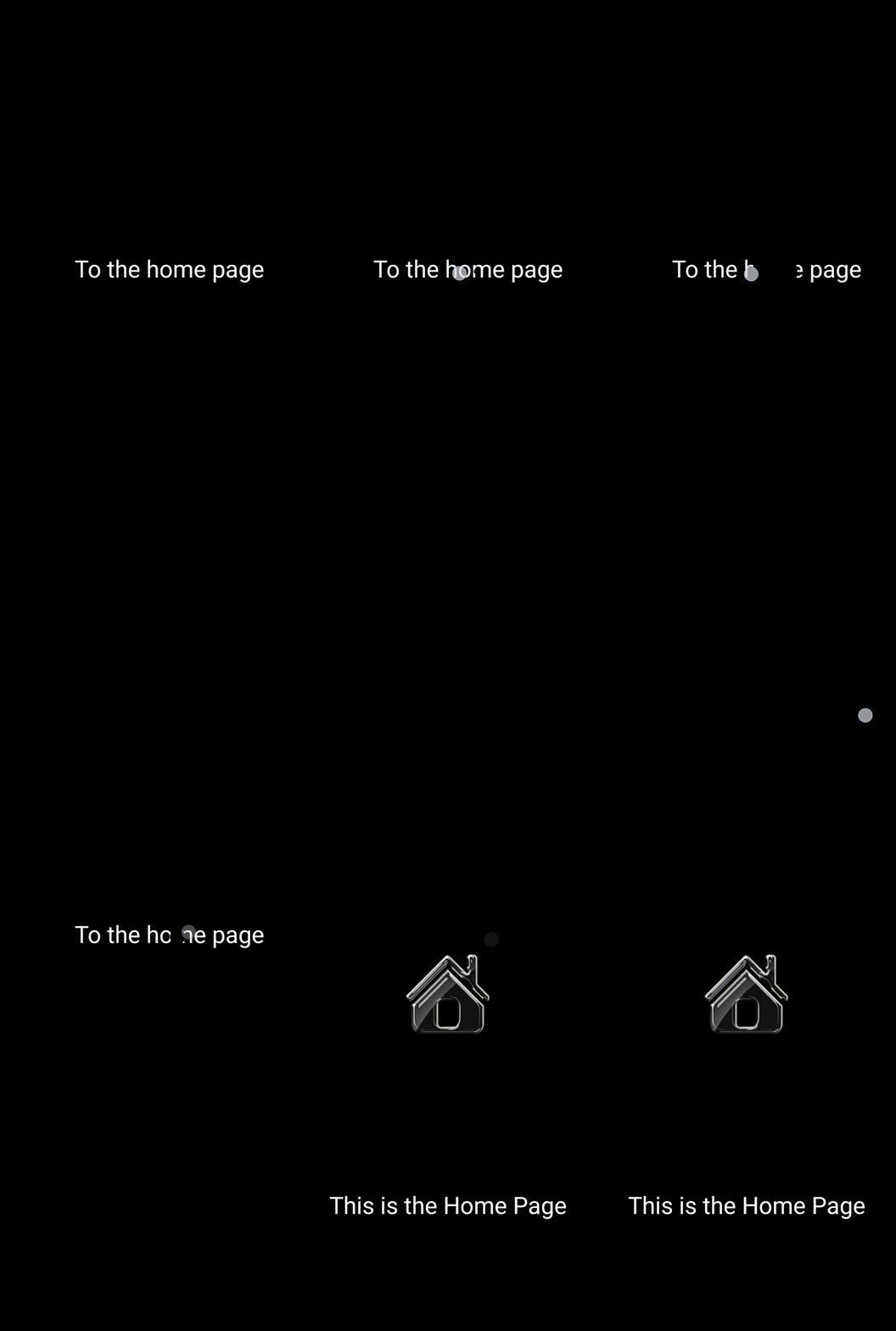
Go to home page
- While current Android versions provide a “swipe up from bottom” to return to the home page, some multi-page setups may be better suited to have a screen location for the user to select. This text-based option lets the user navigate to the home page automatically. See the demo of this action: To the home page.
Go to previous page
- Automatically navigates to the page the user was on before activating the action … in other words, the previous screen, which may or may not be adjacent to the current screen.
Go to left page
- Automatically navigates to the page left of the current focused page.
Go to right page
- Automatically navigates to the page to the right of the current focused page.
Go to selected page
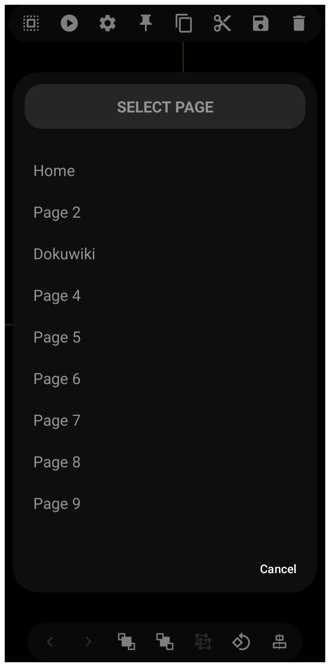
- Automatically navigates to a predetermined page selected at Launcher action user input. The selections are listed by page label (title). See the input dialog which in this case is a 9-page setup. Note: Total Launcher internally records page sequential numbers even for user-named pages, but displays the user names.
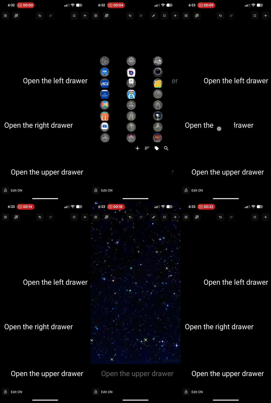
Open left drawer
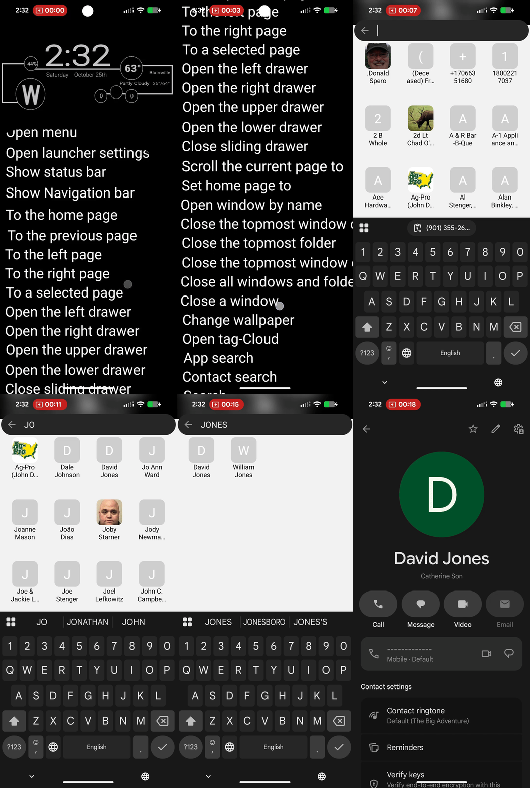
- A drawer is a “container” that holds objects and often hides itself. When an action directs it to come forward, it slides out over existing objects to allow access to its contents, which can include apps, folders, windows, shortcuts, built-in Launcher actions, and images. This discussion covers the left drawer. Other specific originating locations are the right, upper, and lower parts of the screen. The only difference among these 4 is location; otherwise, they have the same capabilities. Via Main Menu > Launcher Options > UI & Animation, the Sliding Drawer section has checkboxes to enable left, right, upper, and lower drawers, which automatically populate with the device's installed apps. You can customize these drawers using the drawer's options icon when you select the container. This text-based Launcher action object opens the drawer. See Widgets, which includes a section on app drawer widgets for a detailed review. See the demo of this left drawer action: Open the left drawer.
This user has found an apparent undocumented feature. Tapping the right or left edge of the screen opens the left or right app drawer. The top and bottom drawers will not open with a screen-edge tap. Please comment in this wiki whether users have confirmed this on other devices.
Open right drawer
- Same as Open left drawer above.
Open top drawer
- Same as Open left drawer above.
Open bottom drawer
- Same as Open left drawer above.
Close sliding drawer
- This Launcher action will close any sliding door (left, right, upper, lower) that is open. Android's built-in gesture can close drawers: swipe in the direction it would close. If a user uses this action, placing the text object on the page will not be useful, since the drawer, when open, covers the full screen by default. While the drawer can be manually resized (difficult), the apparent shield prevents touching any objects below it. Therefore, alternatives to swiping closure are locating and positioning the text object within the drawer or including the Launcher action within a sequence.
Scroll the current page to
* This action allows an input of 0 to 100, which refers to scrolling a page with a continuous vertical layout to a specific position. The input number (0-100) functions exactly like the position of a vertical scrollbar handle. This action is only effective if the page has been designed to vertically scroll (see How To: Page Scrolling - Vertical). * How to determine the value: The value represents the percentage of the Available Scroll Range. Using this simple alignment rule, the result is:
- 0: Aligns the Top of your page content with the top of the screen.
- 50: Aligns the Exact Middle of your page content with the middle of the screen.
- 100: Aligns the Bottom of your page content with the bottom of the screen.
See a demo explanation of this Launcher action.
How does it work?
Imagine a physical scrollbar on the side of your screen.
- Setting the value to 0 is like dragging that bar all the way up.
- Setting it to 100 is like dragging it all the way down.
- Setting it to 50 puts the scrollbar exactly in the middle, centering the page content on the screen.
☛ This action only functions on pages where the content height exceeds the screen height. If the page does not need to scroll (content fits on one screen), the action will have no effect. The most effective use of this Launcher action would be in a sequence using a Launcher action Go to page, Scroll current page to 'n' where the target page is designed with an extended vertical scroll and the targeted object (widget?) position is to be placed at an optimal viewing position.
Set home page to
- Creates a text object to manage which setup page is designated as the setup's home page. During creation, a dialog lists all setup pages here with the page title assigned to each. The user designates which page is the home page. This is a static setting, but you can add text objects and use
Tap-on-Actionto designate other home pages (even with multi-directional swiping). This is useful for different scenarios, such as home, office, travel, etc.
- It is possible to combine this
Set home page toaction with the automation app Tasker (and possibly MacDroid) to create an automatic switch of “home” pages based on time of day, geo-location, or wifi source. See “How To: Set Launcher Page based on Location / Wifi / Time with Tasker integration > current” to implement this.
Open window by name
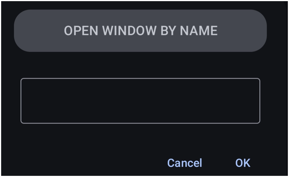
- The open window named by the user in this dialog for this Launcher action setting will be opened. Note: when creating a window, a title must be provided. That is the name to be used in this action, and it must match (no blank spaces, only underscores). It is unusual that the developer requires character entry for the window name instead of providing a dialog with the existing names listed (as done for the Launcher action
Close a window).
Close the topmost window or folder
- When multiple windows or folders are open at one time, this text object will close the topmost, most likely the most recently opened one.
Close the topmost folder
- This action will close the topmost folder (not a window), which is most likely the most recently opened one.
Close all windows and folders
- Closes every open window or folder that is open.
Close a window
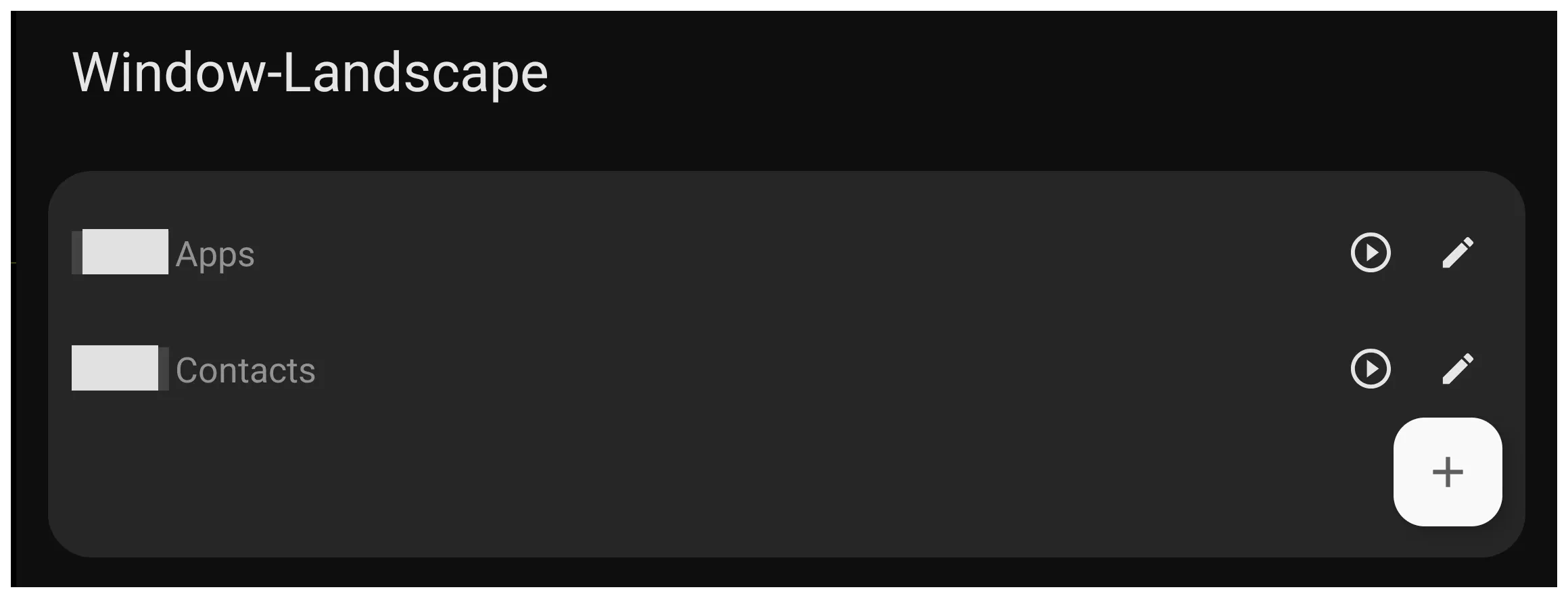
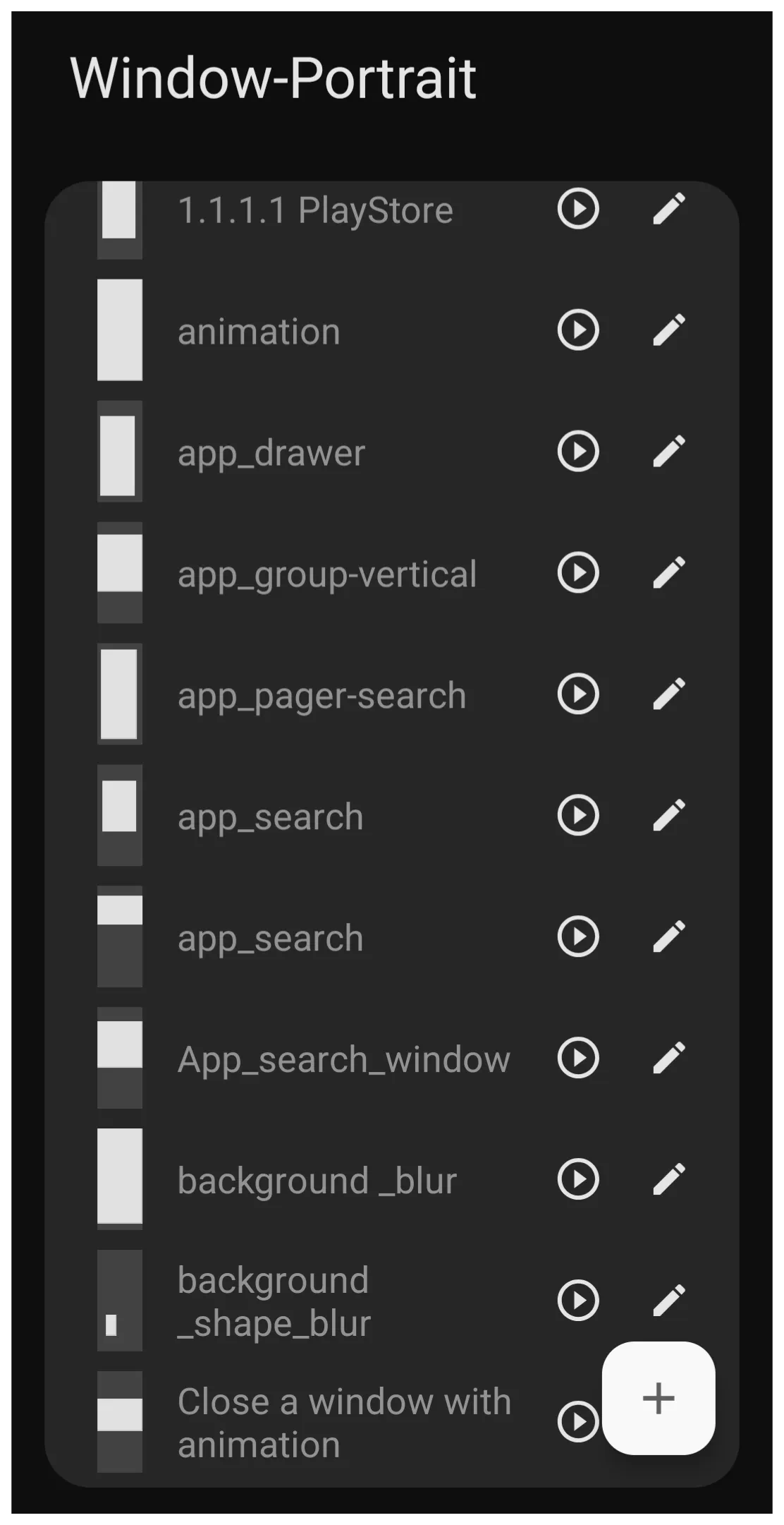
Note: Since screen ratios differ between portrait and landscape, users creating windows for both orientations should configure them (add the object while in positional mode) for proper reproduction.
Change wallpaper
- Tap this text object to cycle through wallpapers located in the folder as designated by
Launcher Options > UI & Animation > Wallpaper. Cycling is alphabetical by filename, so for a custom sequence, rename the files with a numerical prefix.
Open tag
- Tap to open a pre-selected tagged group of apps, windows, or folders. An example of that dialog is here showing both the built-in and user-created tags together. Tags can be user-created and assigned within app widgets, with built-in tags available for the user to manage at
Launcher options > Behavior > App drawer > Built-in tags.
App search
- This is a quick application search widget, similar to the widget “App Drawer”, but not customizable. It immediately displays the keyboard for full alphanumeric search. A sample of this widget and how it can be customized can be viewed at Customizing App & Contact Search.
Contact search
- This opens a widget-type screen with a contact icon grid on the top half of the screen and a full keyboard on the lower half. Search results are immediate with sequential key entry. Tapping the desired contact icon opens the phone app contact data page for dialing. See the action demo for contact search.
Search
- Opens an internet search dialog with full keyboard support, which defaults to Google. There are no customization options. If another search engine is desired, consider using the Launcher action Open URL for the search engine's URL.
Open recent apps
- This presents a card-type view of apps (scrolling left or right) which have recently been used, allowing a quick switch between them. Before Android 10, this used a dedicated navigation icon at the bottom of the screen. After Android 10, this is offered by a swipe-up gesture from the bottom of the screen. The user may also see this Total Launcher initial permission notification with this dialog.
Screen lock
- Returns the device to the screen lock state provided by the Android settings, usually a dark, off display. This is not to be confused with the “lock screen” or “always-on-display” screen, which usually appears when the “screen lock” screen is tapped. The safeguard usually requires a pattern, PIN, or password to re-enter the device. The user may also see this Total Launcher initial permission notification with this dialog.
Restart home
- This automatically navigates to the setup's designated home page as was assigned in
edit mode > edit on > page selection > home icon tapor by using the Launcher action Set home page to.
Auto-rotate screen
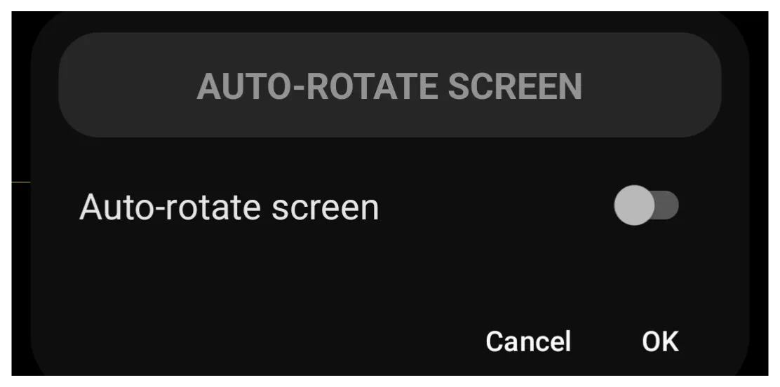
- Auto-rotate screen accommodates the screen orientation to the user's eye irrespective of the device orientation. The device itself has Android settings to set this state on or off. This Launcher action lets the user set the state without diving into Android settings or quick tiles. When selecting this Launcher action, the user typically sets two separate actions, on and off, which will counteract the current Android state. The user will designate this slider button (left and default) or on (right). This is not a toggle for the screen or the gesture used to activate it, but a discrete action state, so it requires two objects or gestures.
Brightness level
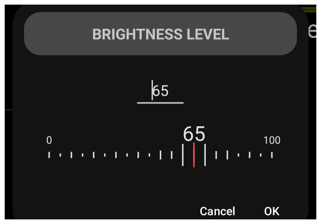
- Again, this is a discrete setting for a specific level of screen brightness (value from 0-100). It is not a variable slider. This could easily be used to set indoor-daytime, outdoor, or bedtime levels, but it would require 3 objects or a separate gesture for each setting. When selecting this Launcher action, the setting dialog opens to this brightness level dialog. Permission required: Allow modifying system settings.
Auto brightness
- Acts as a switch to enable or disable the system's automatic brightness feature. This is a discrete setting, not a toggle, for either 'On' or 'Off'.
Media volume level
- Setting media volume level is similar to brightness level, in that it is for a specific level not variable levels. It adapts to scenarios (church, game, office) but could be easily hacked to appear as a quasi-slider, with each level “bulb” along a “slide line” as a discrete media volume level object. The media volume dialog has a data value range of 0-100.
Do not disturb
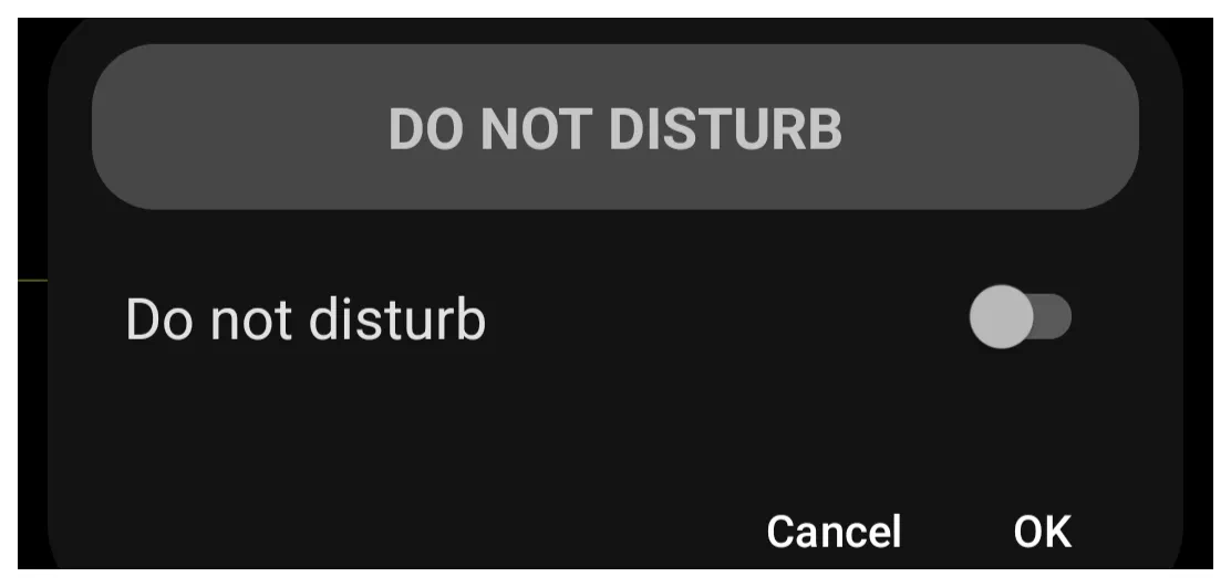
- This is Android's feature to silence or hide notifications, ringtones, alarms, etc. during user-customized times. The Launcher action is discreet, either on or off, to override the device's current system on/off setting (but not the user-customized features). This design keeps setting control within the setup and avoids relying on Android access. This requires both on and off objects when setting the state in the Do Not Disturb dialog.
WiFi
- The Launcher action sets wi-fi on or off. To overcome an Android limitation, Total Launcher's developer offers a utility,
 TotalTool, for free download from the developer's blog.






This download is an APK file, and for convenience, search Google for “apk” and download one with “installer” in the title. Install it on the device. Run it; it will find TotalTool (if downloaded to the same device). Select the APK to complete the installation.
The on/off setting is one-directional, not a toggle. Each object overrides the opposite system state when activated.
As of October 27, 2025, the WiFi on/off Launcher action does not work and is considered deprecated, most likely because TotalTools hasn't addressed the appropriate Android version level. A #BugReport was reported, but to date, no change has been noted in updated versions or performance.
Bluetooth
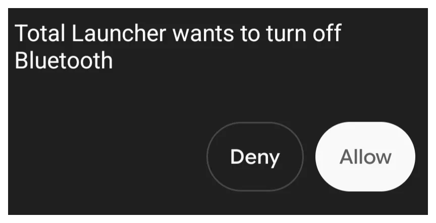
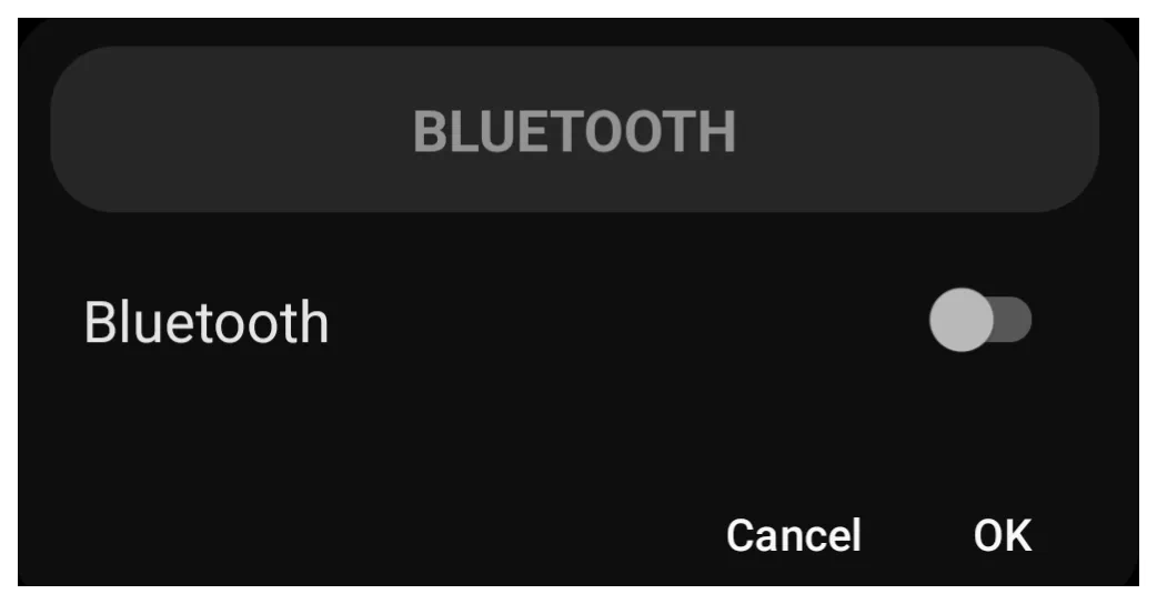
- For the initial request to change the state of the device's Bluetooth, Total Launcher will request the user's confirmation with a screen "toast". After that, the created Launcher action objects (two: on and off) will perform the Bluetooth state designated when using the bluetooth dialog.
Play a sound
- This Launcher action could play right into the hands of a good setup designer … choose any sound from the Launcher's Resources Sound library and it's good to go. Although this action links a single audio file to the target object, the Launcher offers five Tap-on-Action results based on object activation (tap, and swipes left, right, up, or down). So the results can be creative. The user will select the specific object's sound from the dialog.

Launch browser
- Choosing this action will default to the Google Chrome browser, overriding the device's default browser. Alternatively, use the Launcher action Open URL and set the target to the URL of the desired browser service.
Launch calculator
- This will open the device's default calculator (by Google).
Launch calendar
- This will open the device's default calendar (by Google).
Launch camera
- This will open the device's default camera (by Google).
Launch contacts
- This will open the device's default contacts app (by Google).
Launch phone app
- This will open the device's default phone app (by Google).
Launch messaging
- This will open the device's default app, Messages (by Google).
Launch e-mail
- This will open the device's default app, Gmail (by Google).
Launch gallery
- This will open the device's default app, Photos (by Google).
Launch map
- This will open the device's default app, Maps (by Google).
Launch app store
- This will open the device's default app, Play Store (by Google).
Launch music
- This will open the device's default app, YouTube Music (by Google).
Launch alarm
- This will open the device's default app, Clock (by Google).
Select an app
- When an object is assigned this action, it serves as a wildcard for future application selections. Think of it as opening a vertical listing of the device app drawer. Functionally, a user may assign this to a “Banking” icon, then choose from multiple banking apps. But it listsall apps, not just banking. It offers flexibility.
Open URL
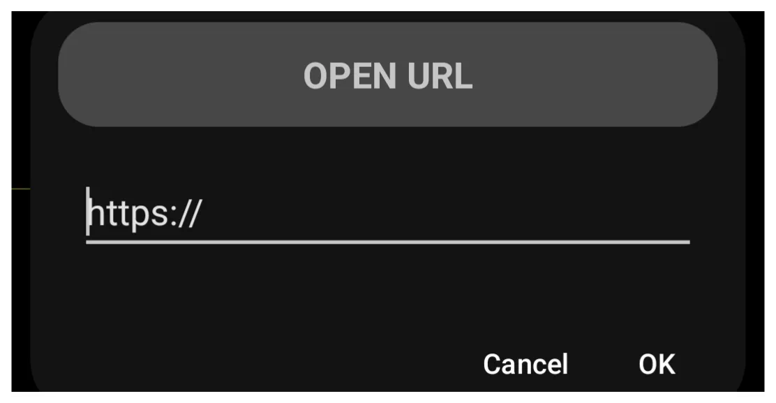
- Think of this as the “King of Customization” or the “Gateway to the Internet”. Just hard-code any URL into the presented dialog. A user is now in control!
===== Hidden Index Anchors =====
Comments & Feedback
Toby Lancer is ready to help! Look for the Quick Help form:
► Desktop: left sidebar located near the bottom for Private to Admin
► Mobile: 3-bar menu at page top.
► Use the Discussion section below to share any experiences and communications with other Total Launcher users.
► Any Registered User can directly update this and any wiki page if desired.
Moderation: To keep the manual clean, all comments are held for appropriateness review. Preview any comment before submitting it. It will not be displayed after submission until it is reviewed. So, please, do not resubmit.
Formatting: If using any code snippets, place them inside code tags (e.g., 'code') using double single quotes (') before and after to keep them readable.
Be Kind: This is a community effort. Please keep feedback constructive and on topic.
~~DISCUSSION~~